


As a designer, I think the most important thing to me is helping others turn what they envision into reality. I think how something is designed speaks volumes about what it represents and if I can help successfully portray something through my designs, this something to get excited and be passionate about.
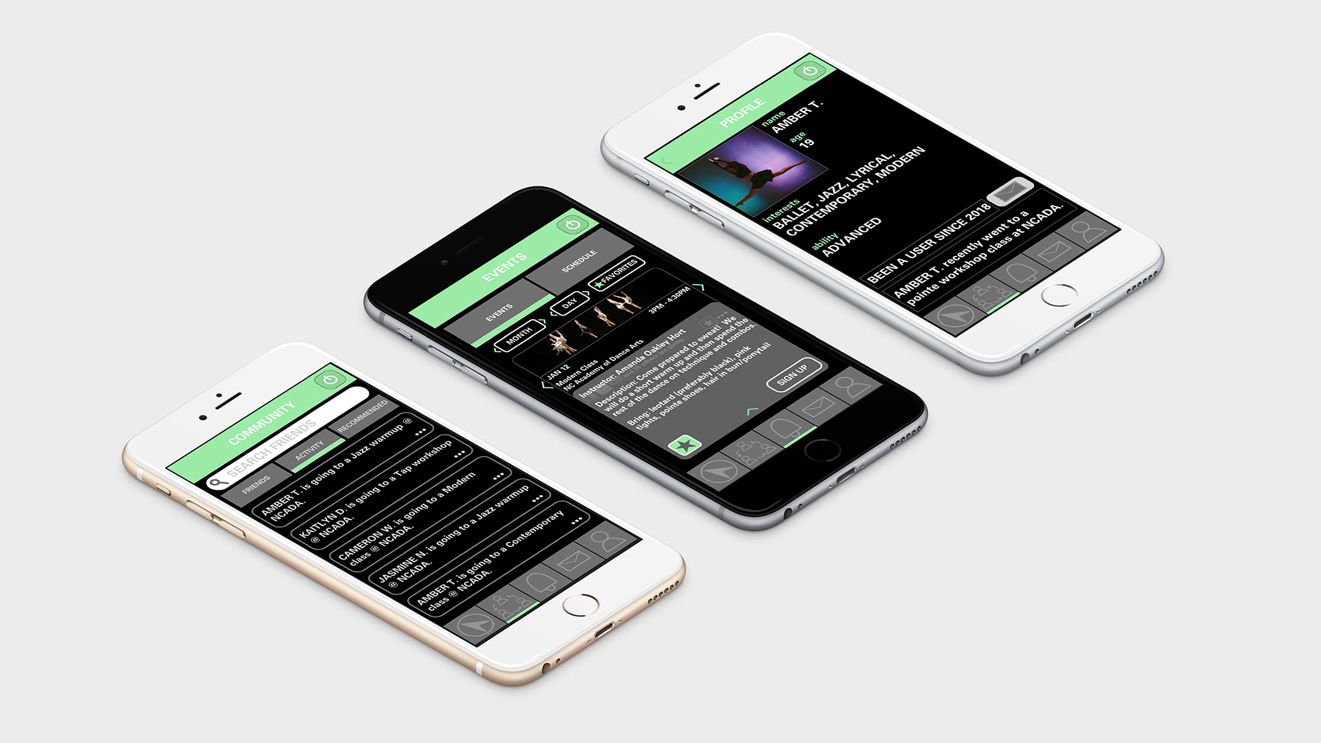
The mobile app project consisted of designing an app that would be useful to the community of Greenville, North Carolina. My app is called Making Moves and it is designed to help alumni dancers reconnect in the dance community as well as match dancers of all backgrounds to the best studios and classes based off of personality and ability. Navigational features assist in easily exploring a studio and their schedule and being able to register for classes. A community feature allows you to find, add, and message like-minded dancers creating a friendly and personalized environment and making it easier to find a studio and community for the dancer’s needs.
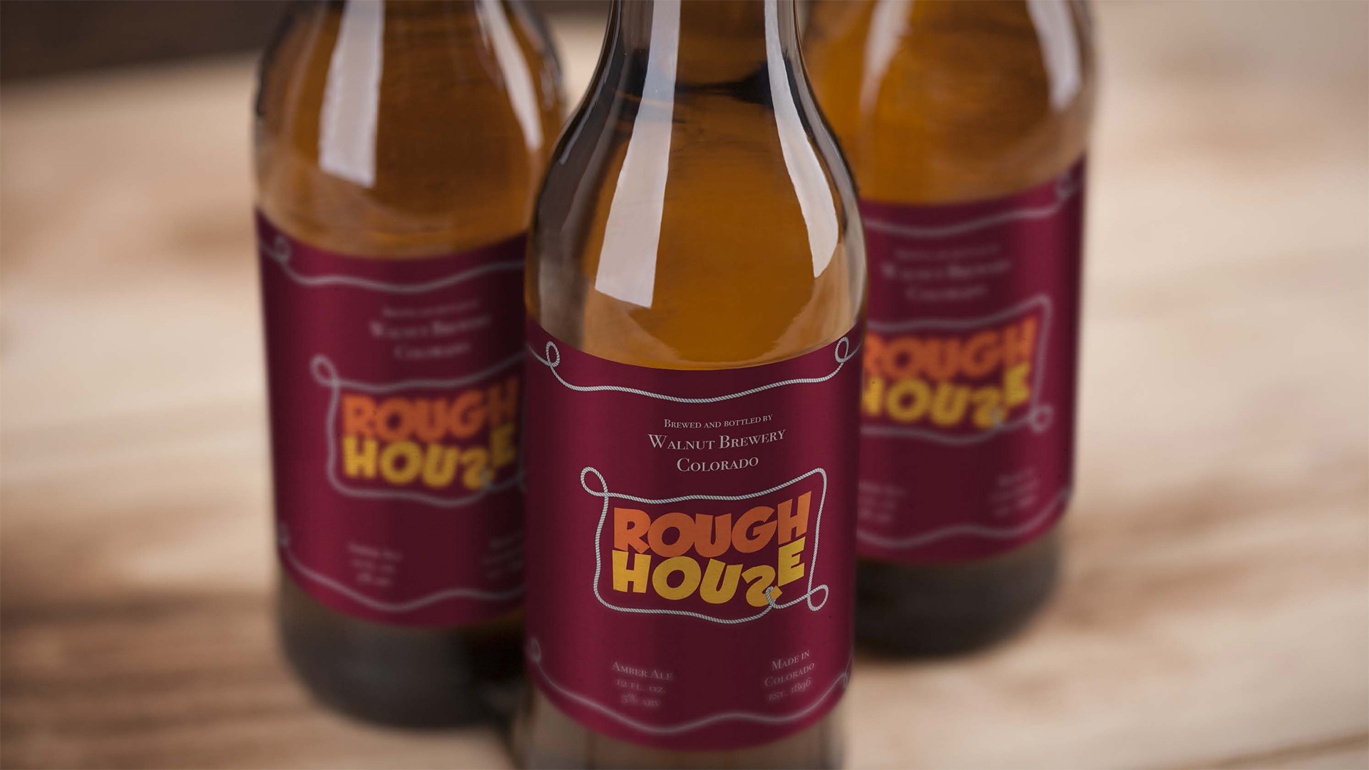
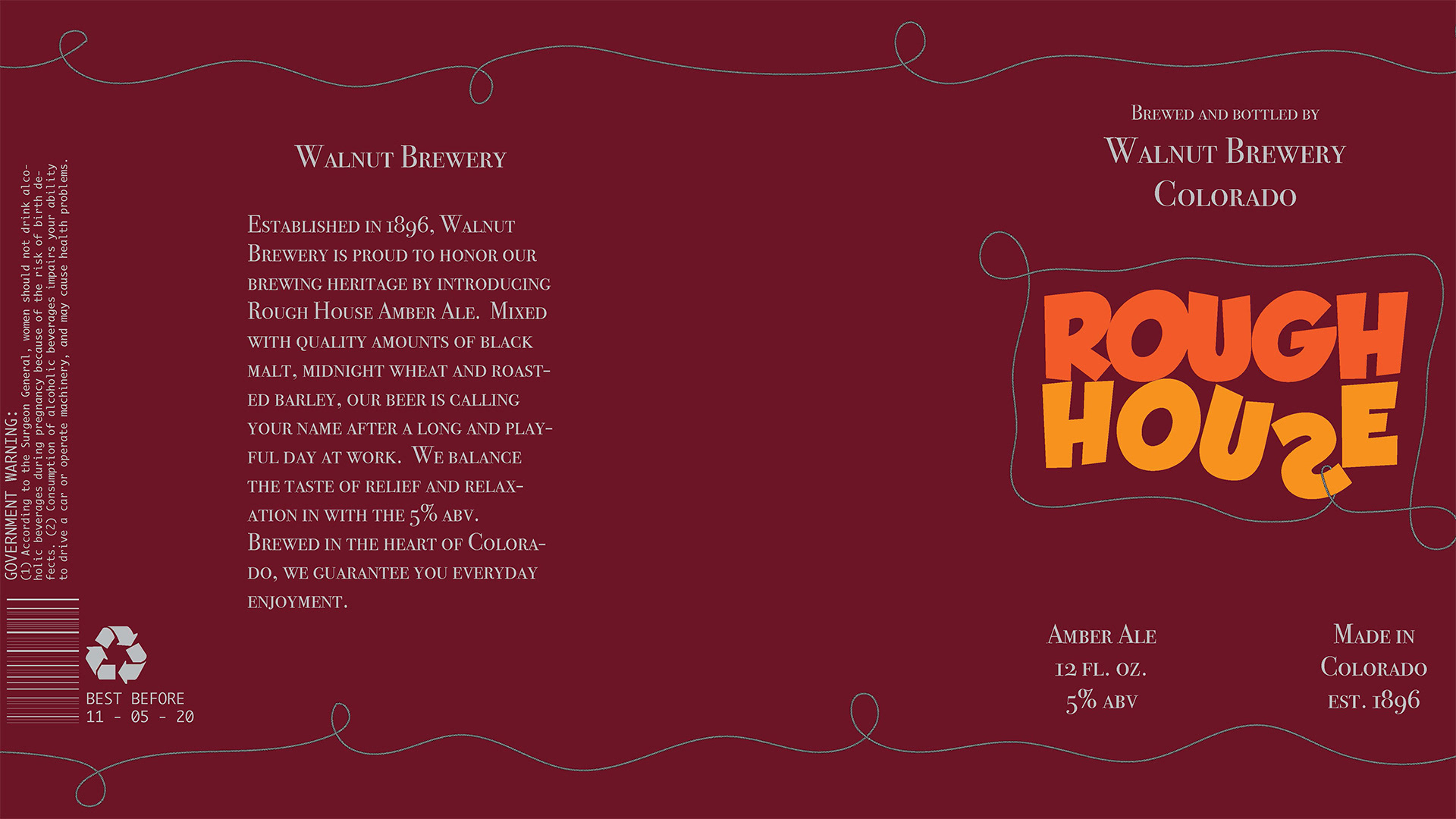
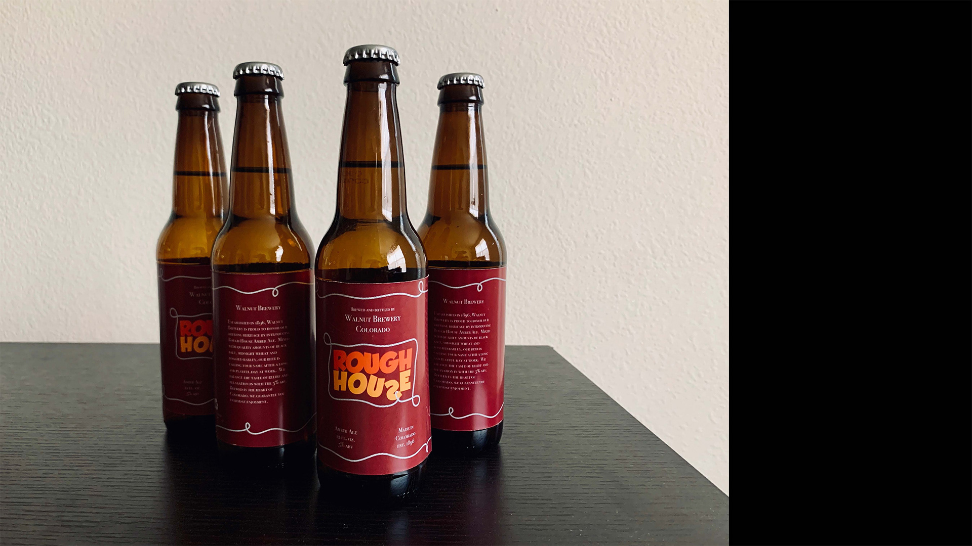
The beer can project was a project where we had to come up with creative designs for alcoholic beverages that would entice the working class. I chose the name, rough house because it reminded me of the play on words that defines an instance of boisterous play. After coming up with my typeface and design, I decided that it would look better on a bottle so thus a beer can project became a beer bottle project. I was also tasked with bringing this design to life as we had to print our labels out and attach them to bottles so included is a photo of a few of my final bottles.
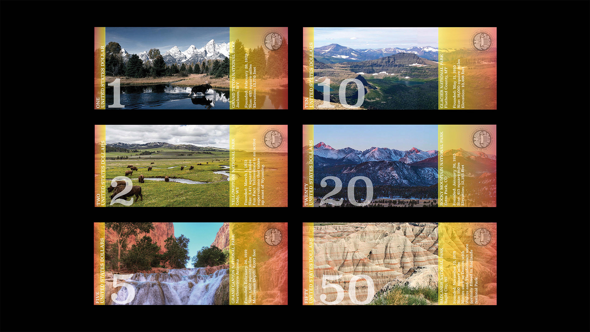
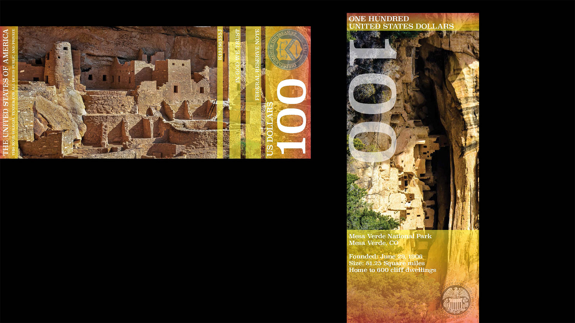
My currency project was one that I got to personalize in the slightest. My concept of redesigning American currency included the idea of national park preservation. I chose to do this by including almost a postcard feel with photos from seven different parks and a few facts as well to serve as a reminder of how beautiful our parks are, and this is the way it should remain. The fun part was getting to choose which parks I wanted to include on each bill, and I decided to use the seven parks that I have visited before.
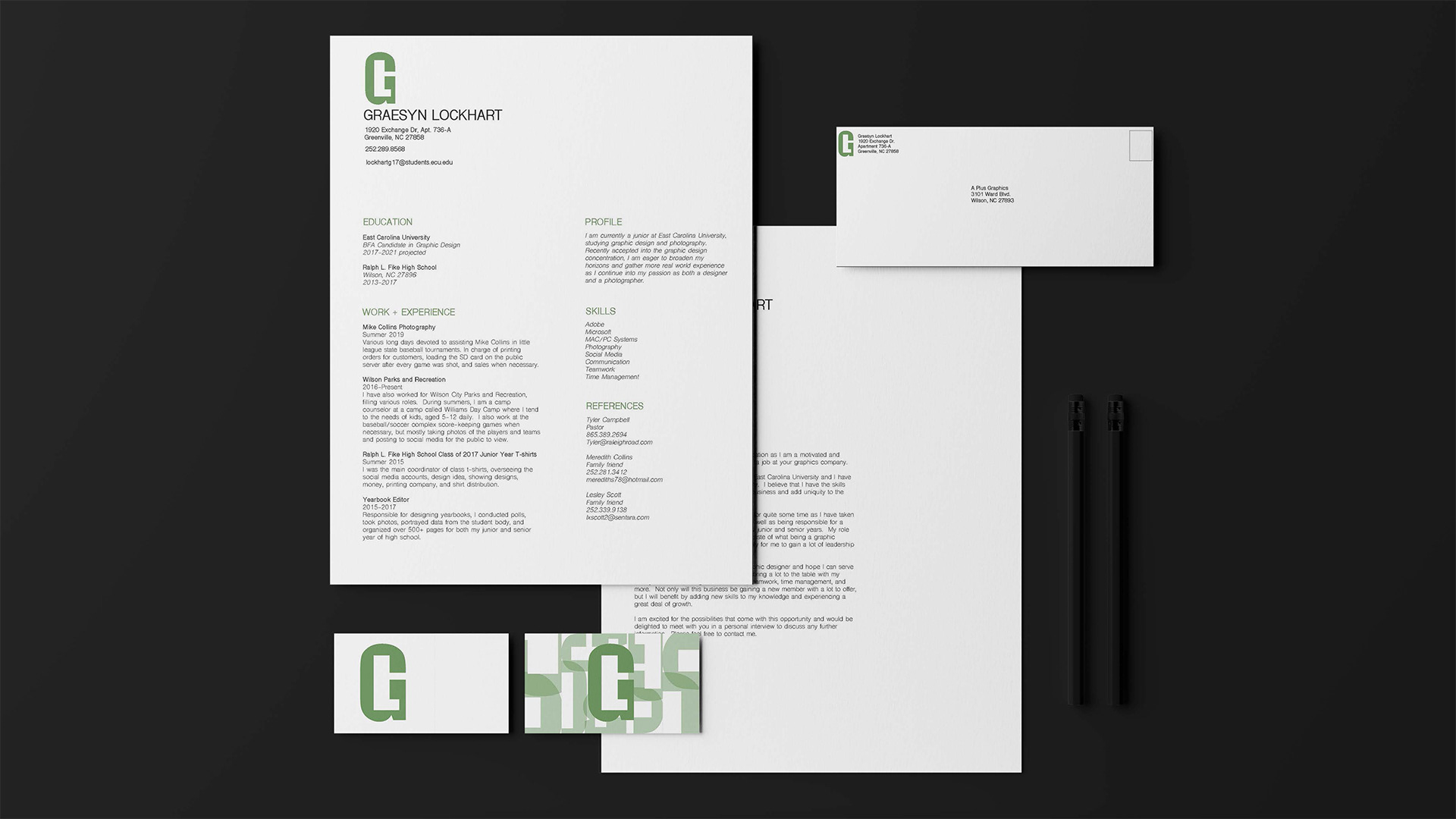
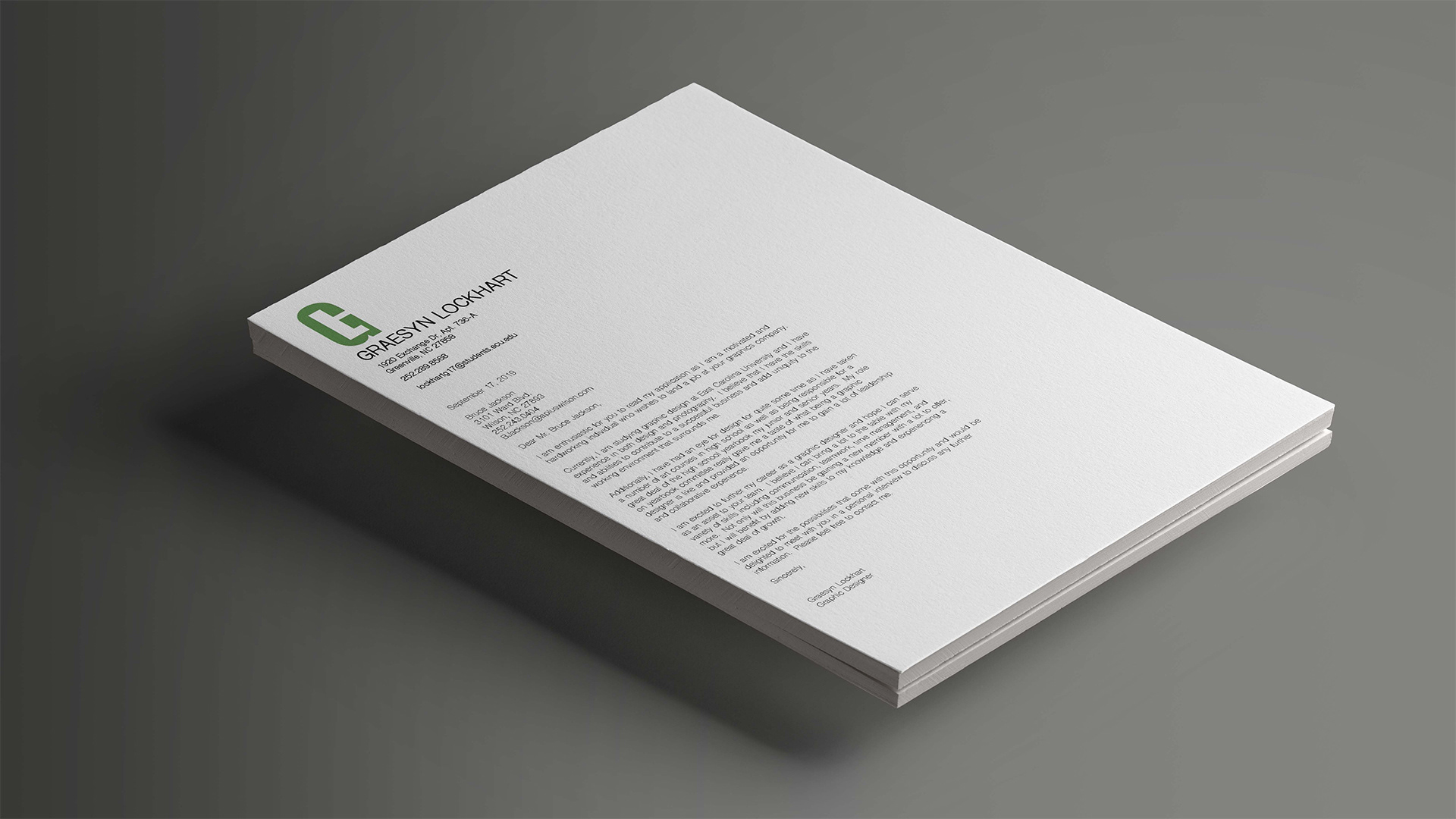
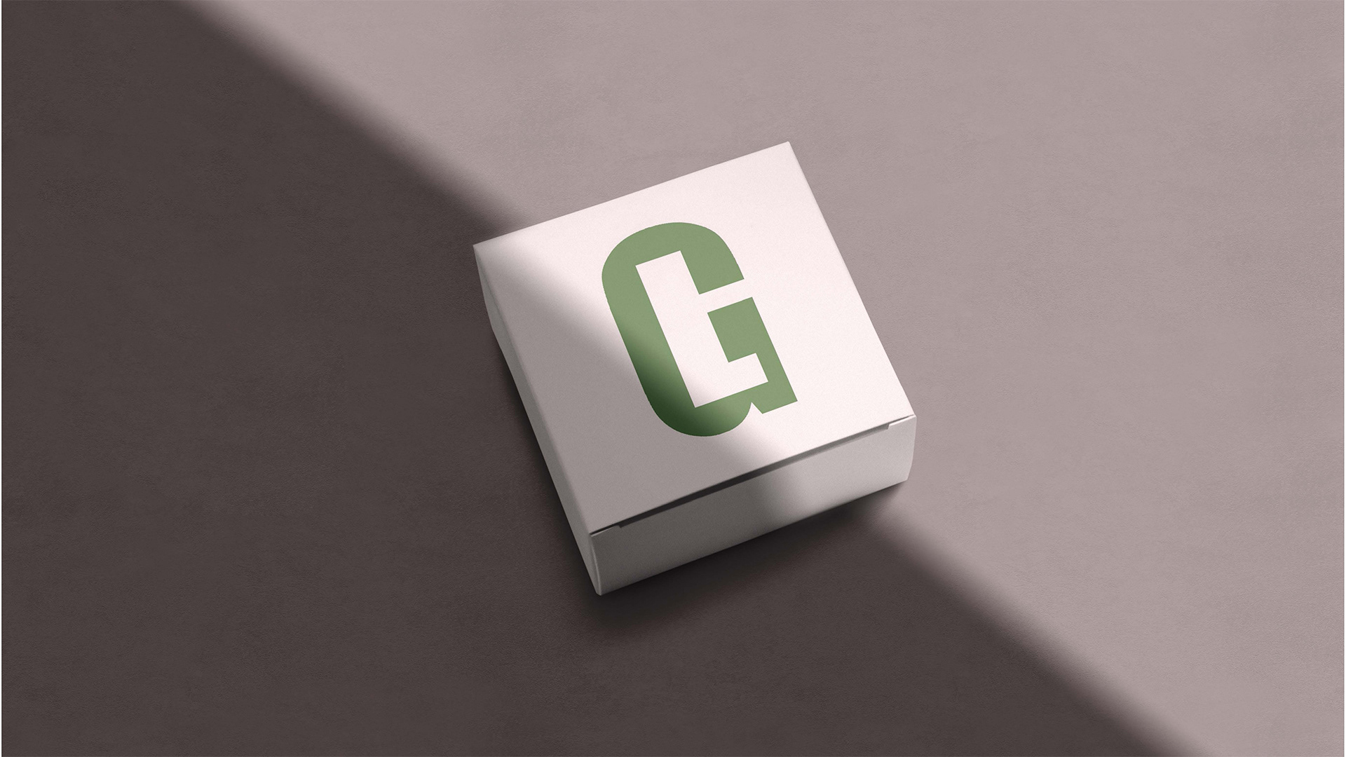
The branding project was a project that was useful as well as entertaining for me. It really helped create the best brand for me and personalize who I was into a mark. Experimenting with different letterforms and placements was a part of growing in the design world and opening up more options that were not completely obvious from the start.
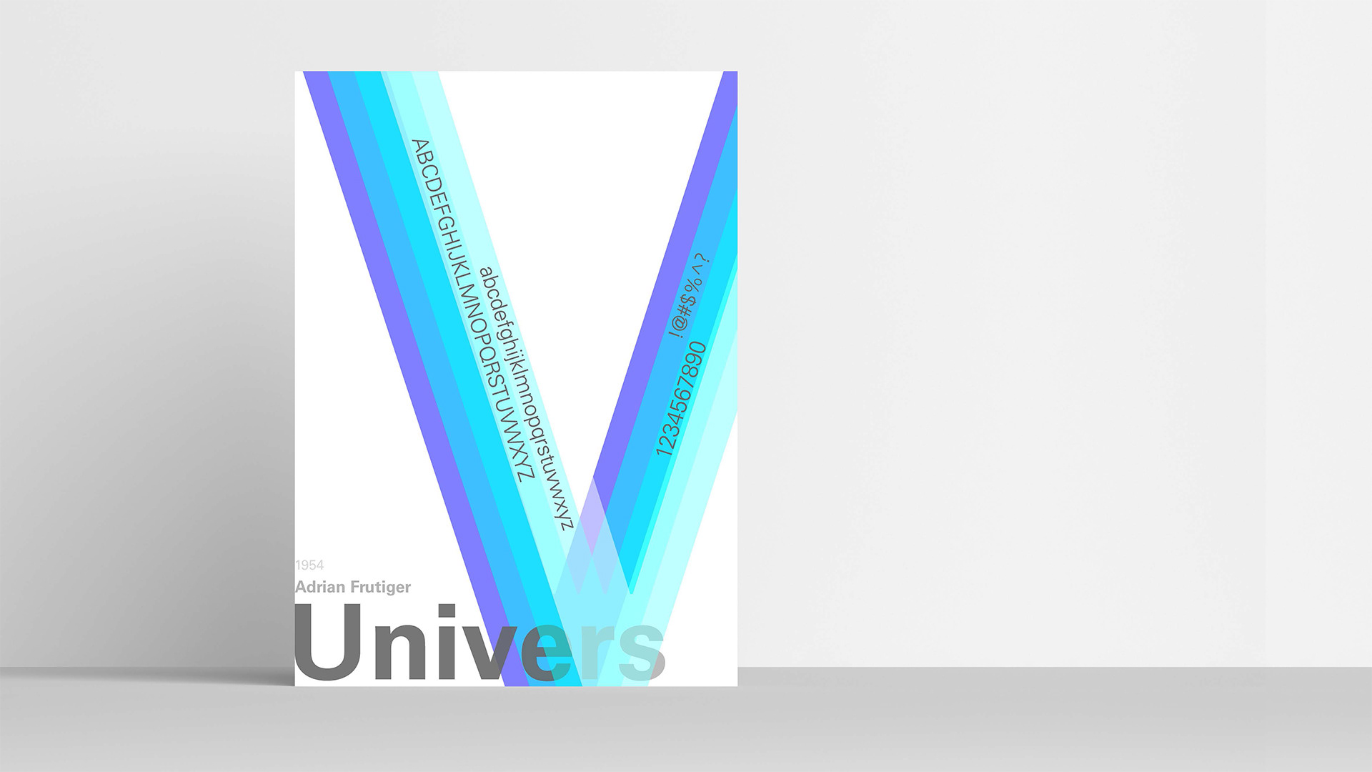
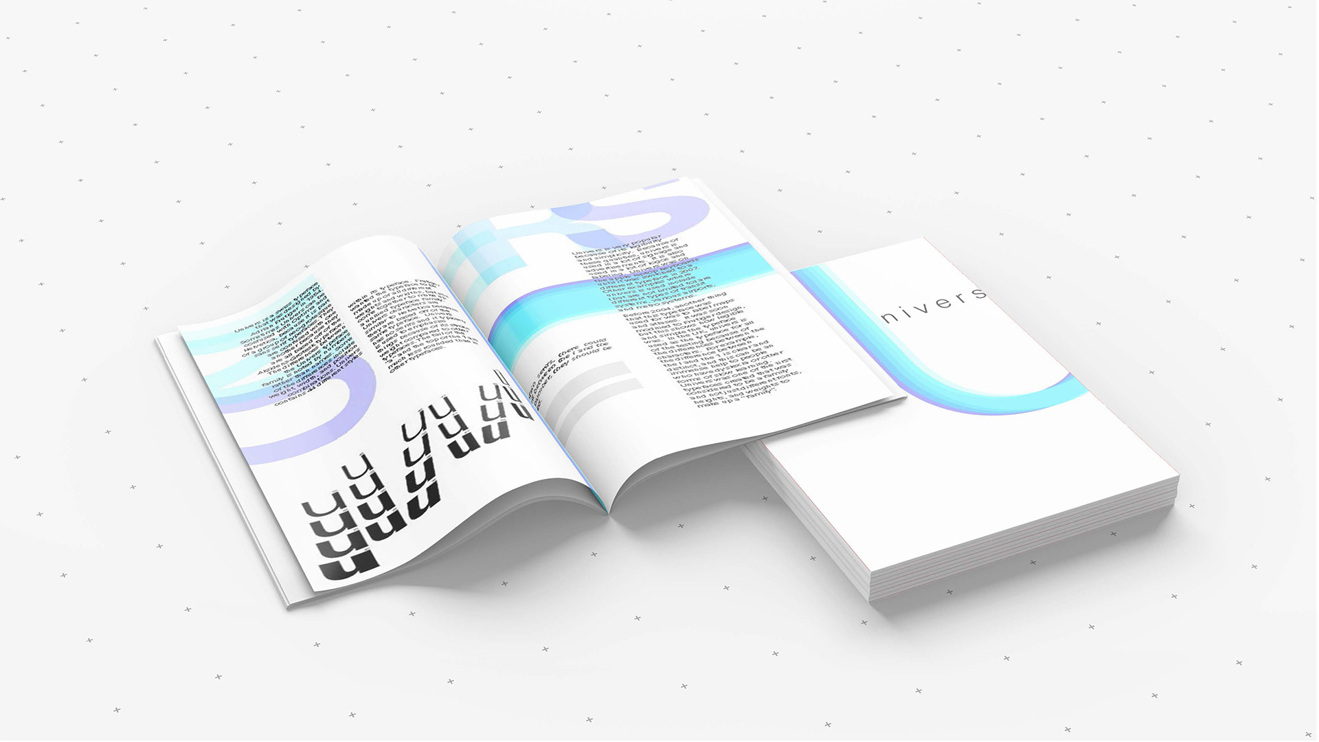
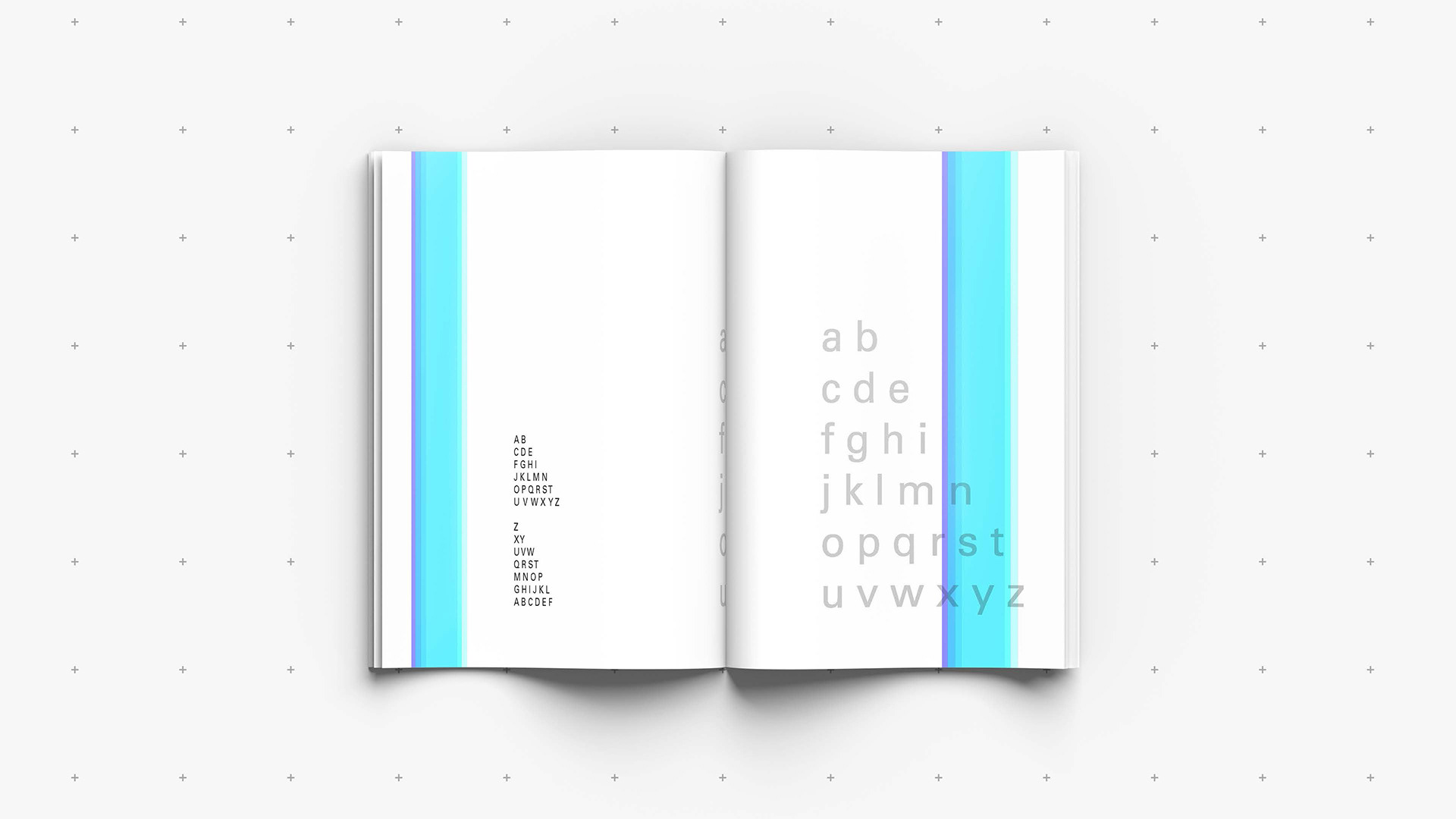
My type design project is one of my favorites that I have ever done. I created a booklet as well as a poster based off of the typeface, Univers. This was not only a creative project but also just as much an informational project as I got to learn a lot about the typeface history and usage. My design is mostly based off of swiss design hence the bright, overlapping colors and Univers has become one of my favorite typefaces to use.
@graesynldesign
lockhartg17@students.ecu.edu
252.289.8568