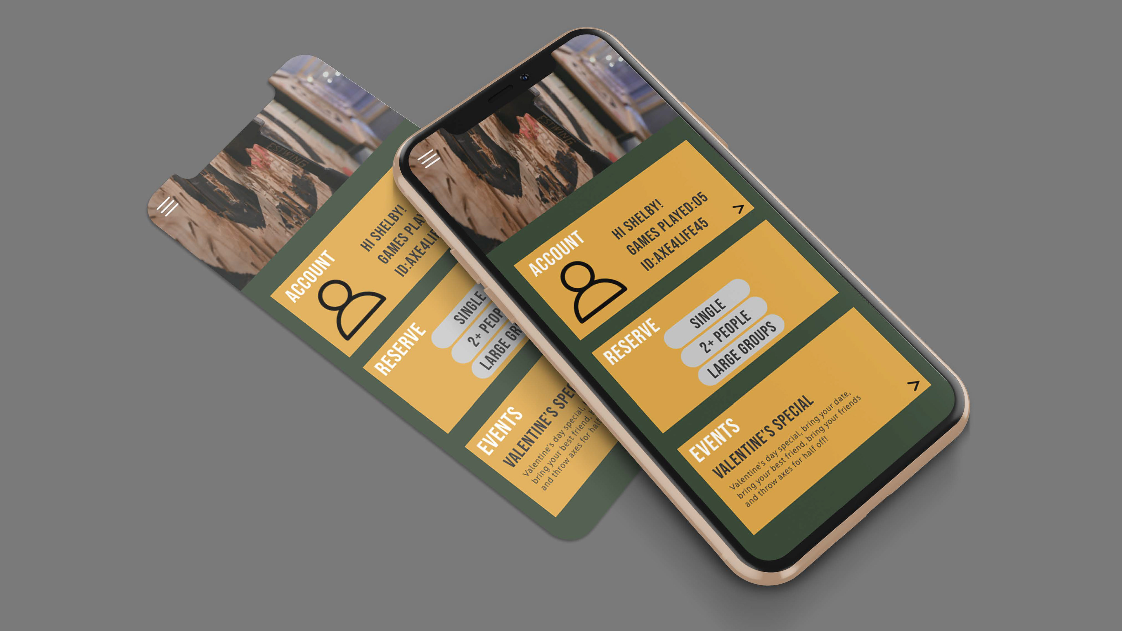

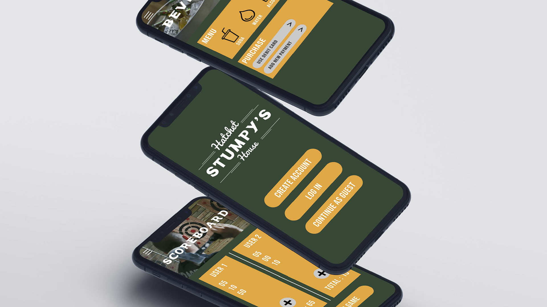

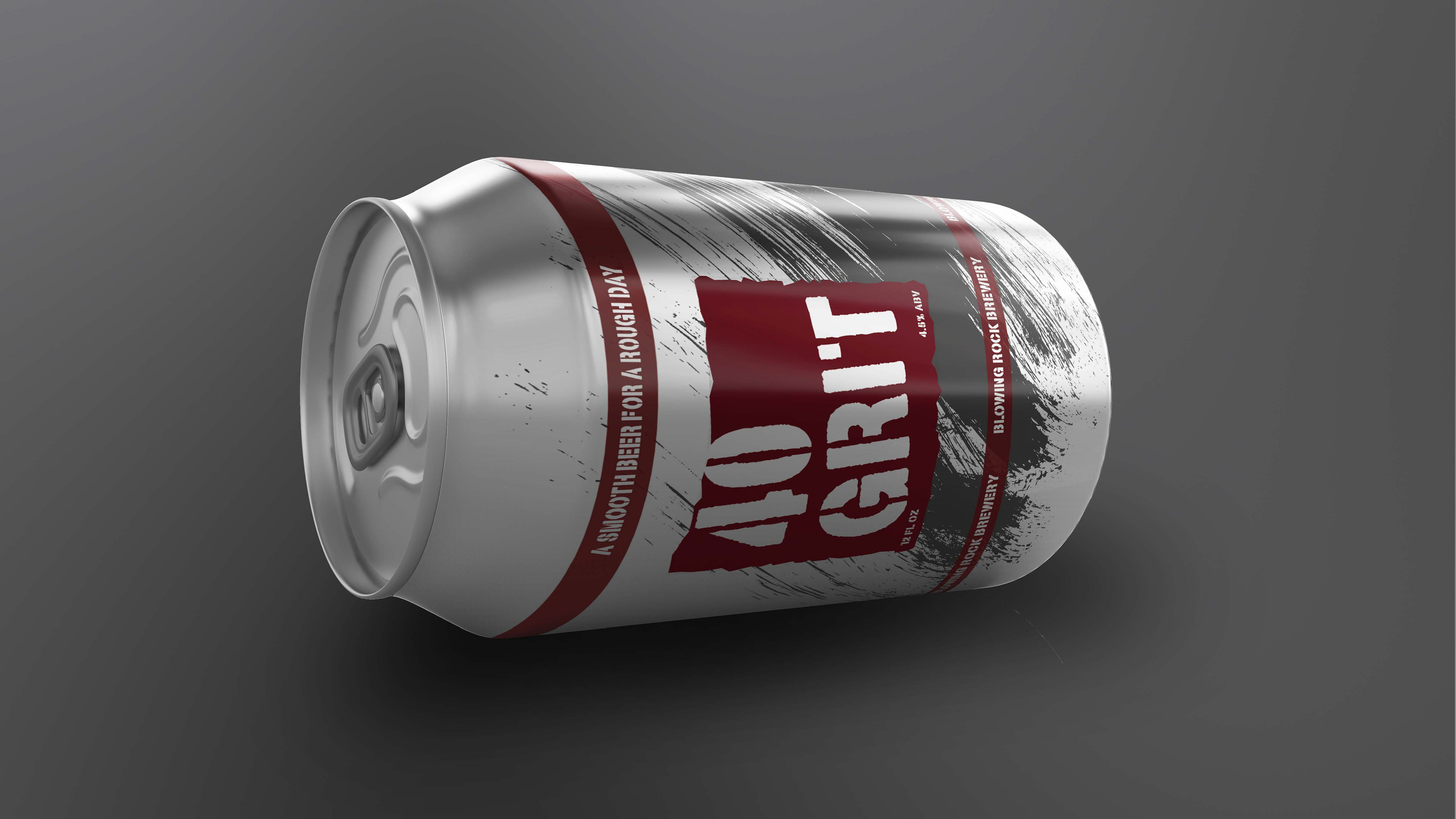
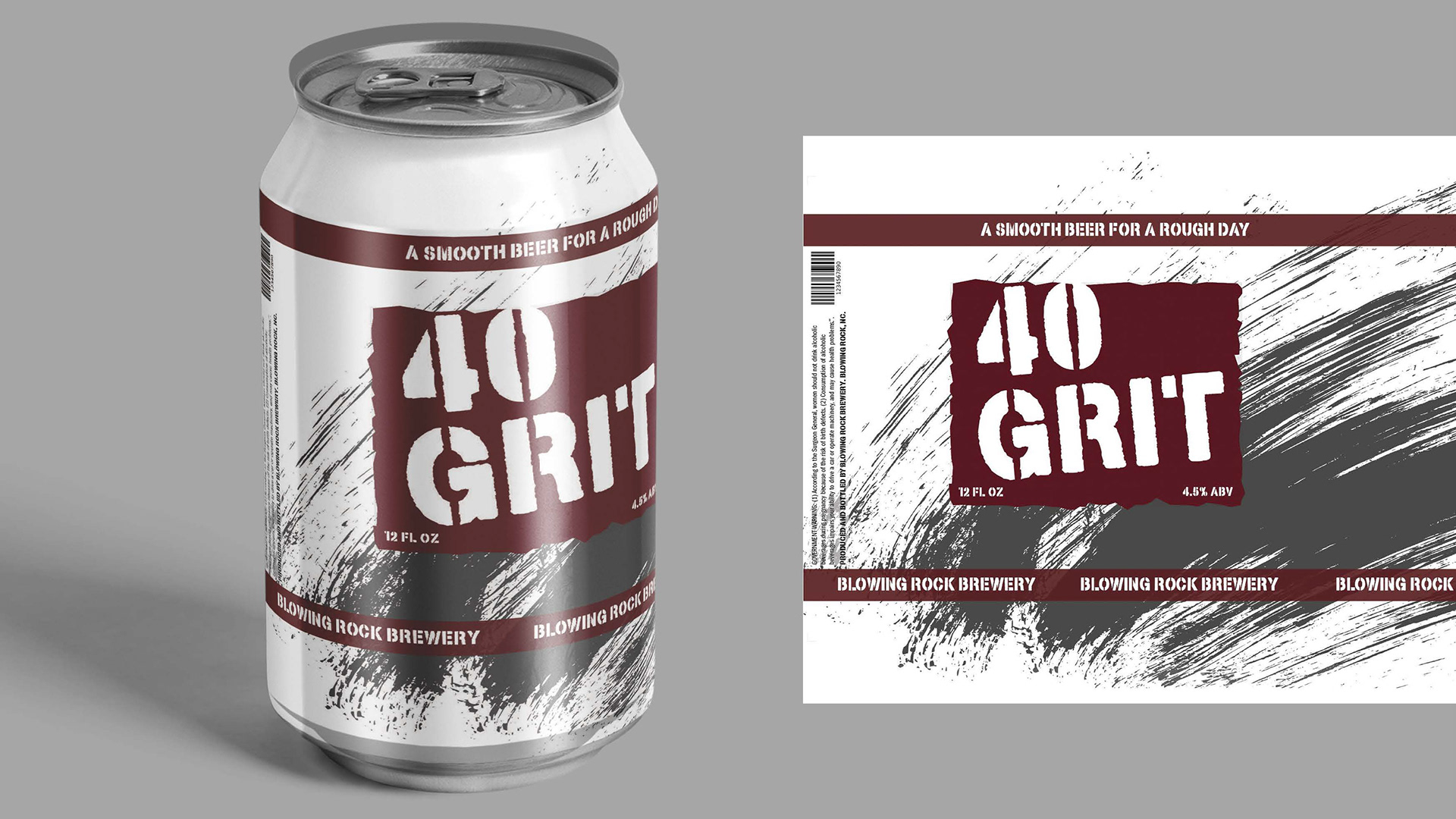

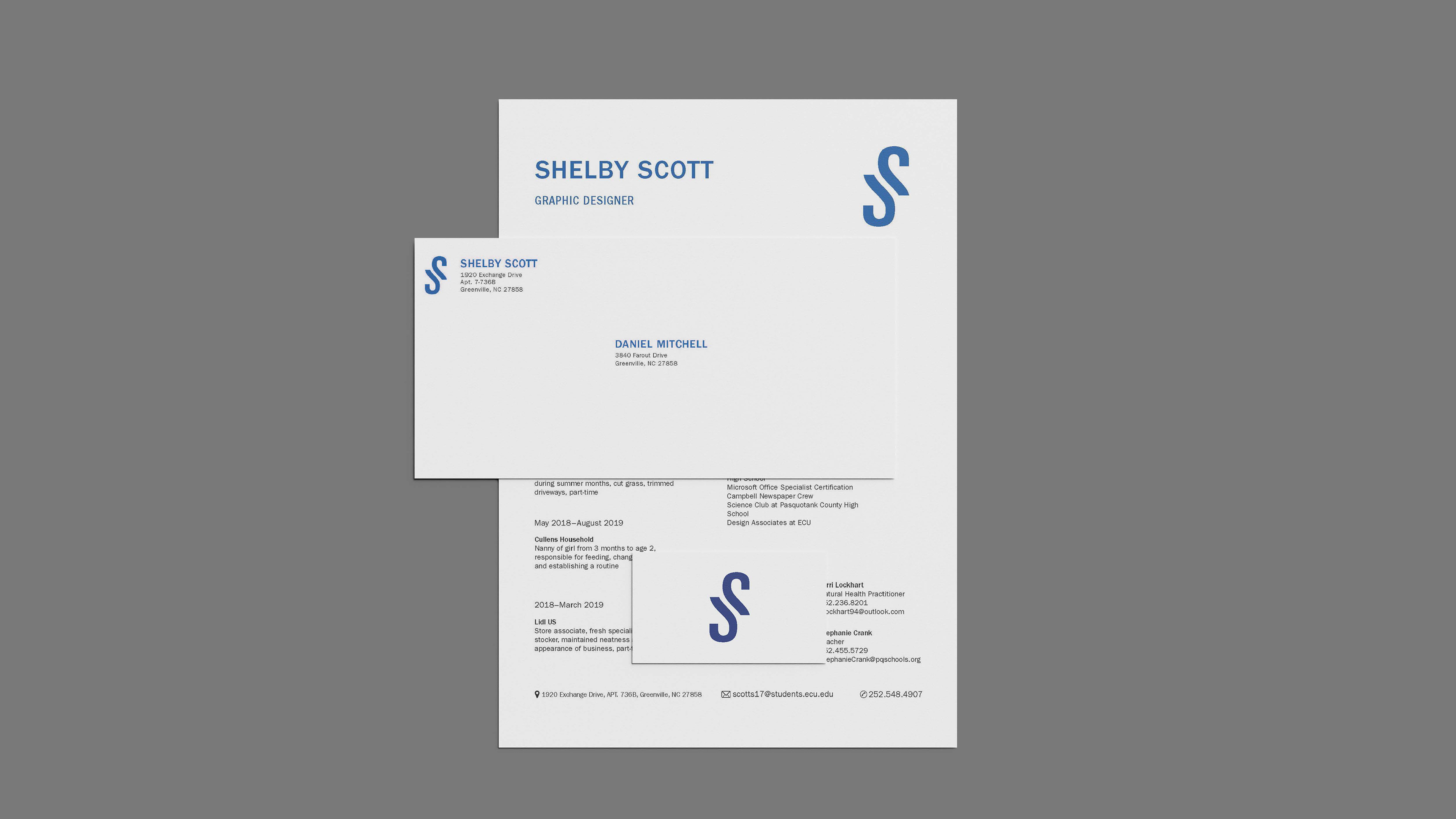
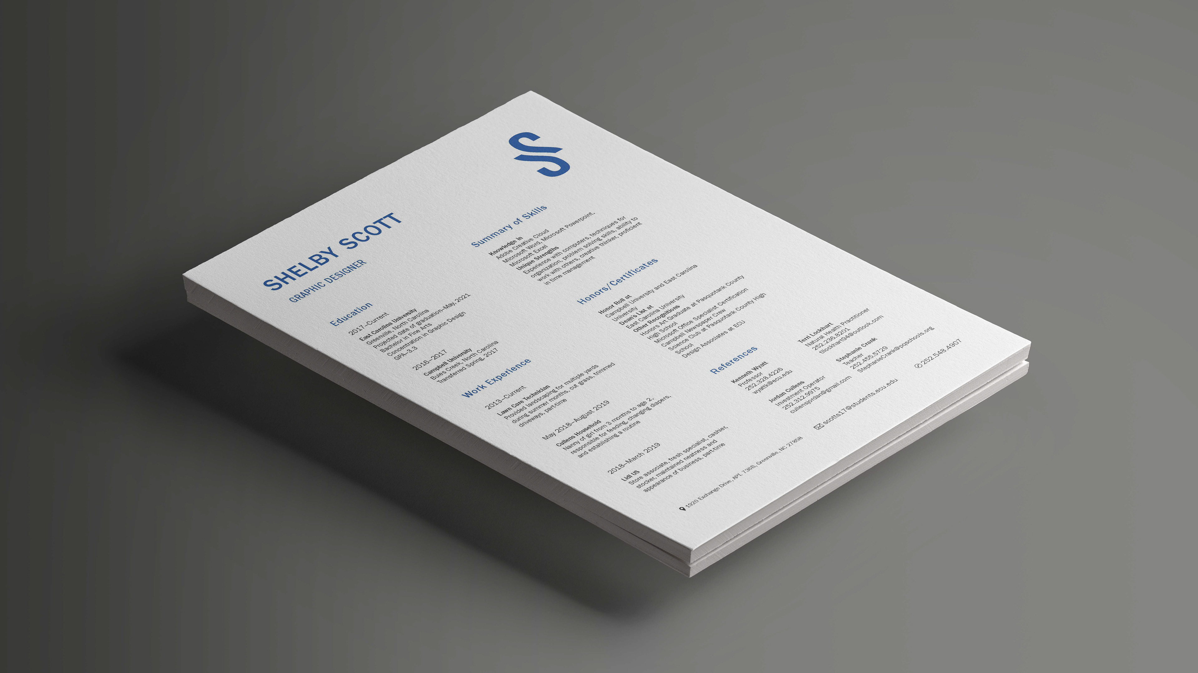
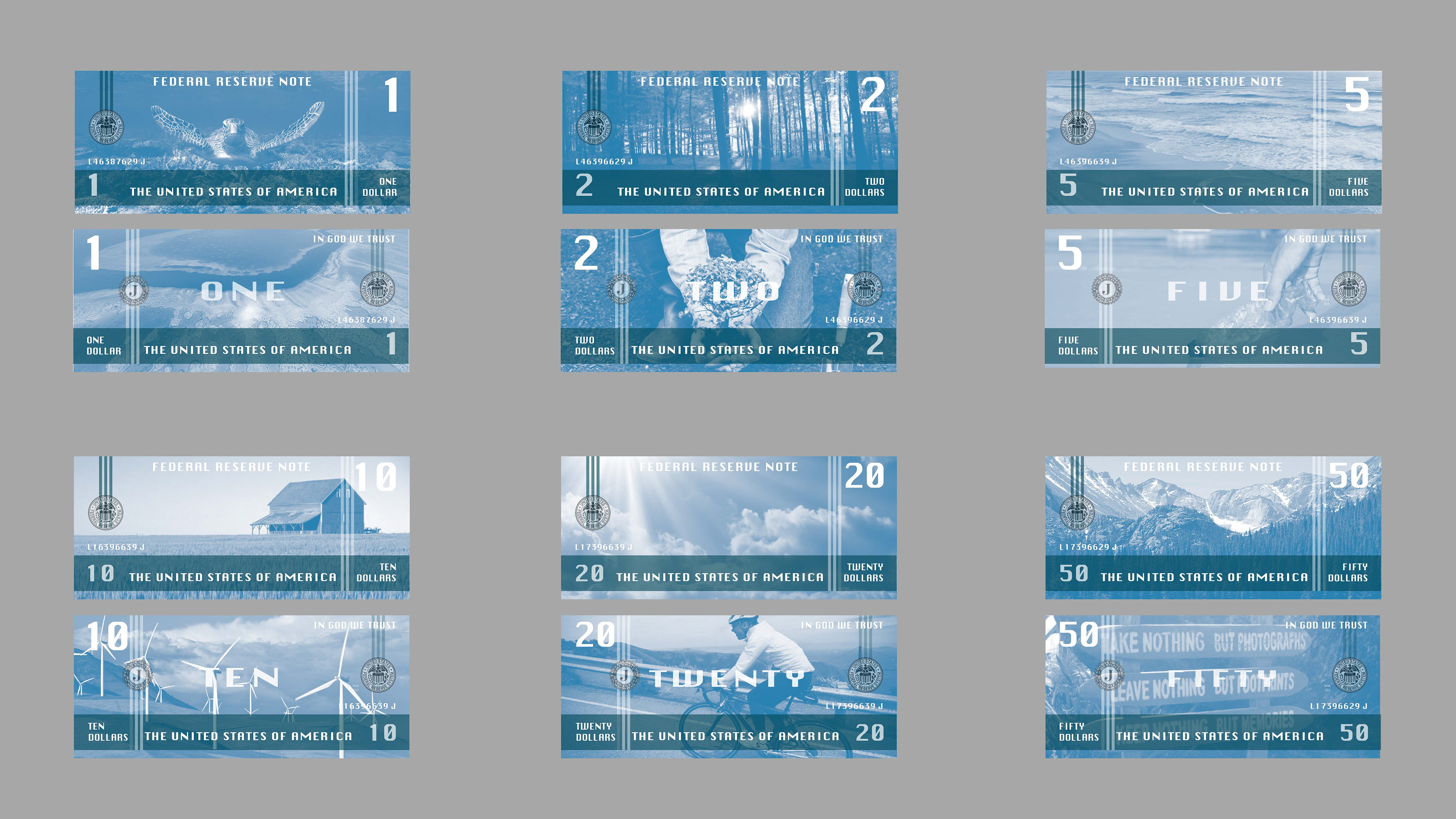
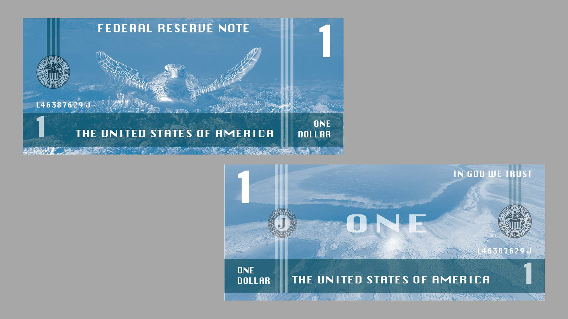
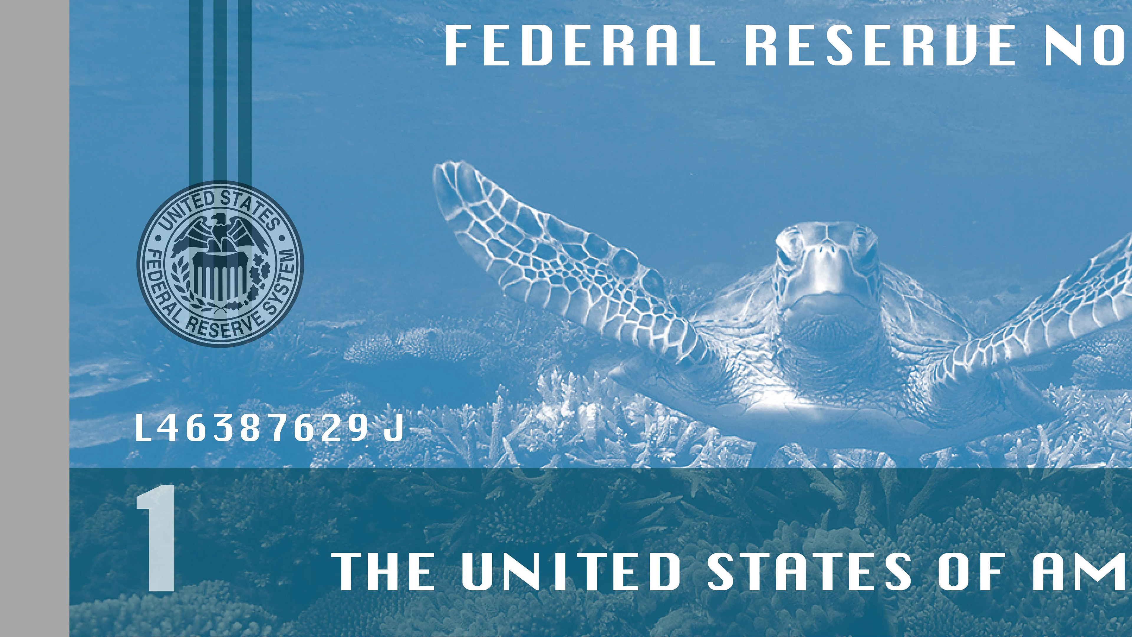

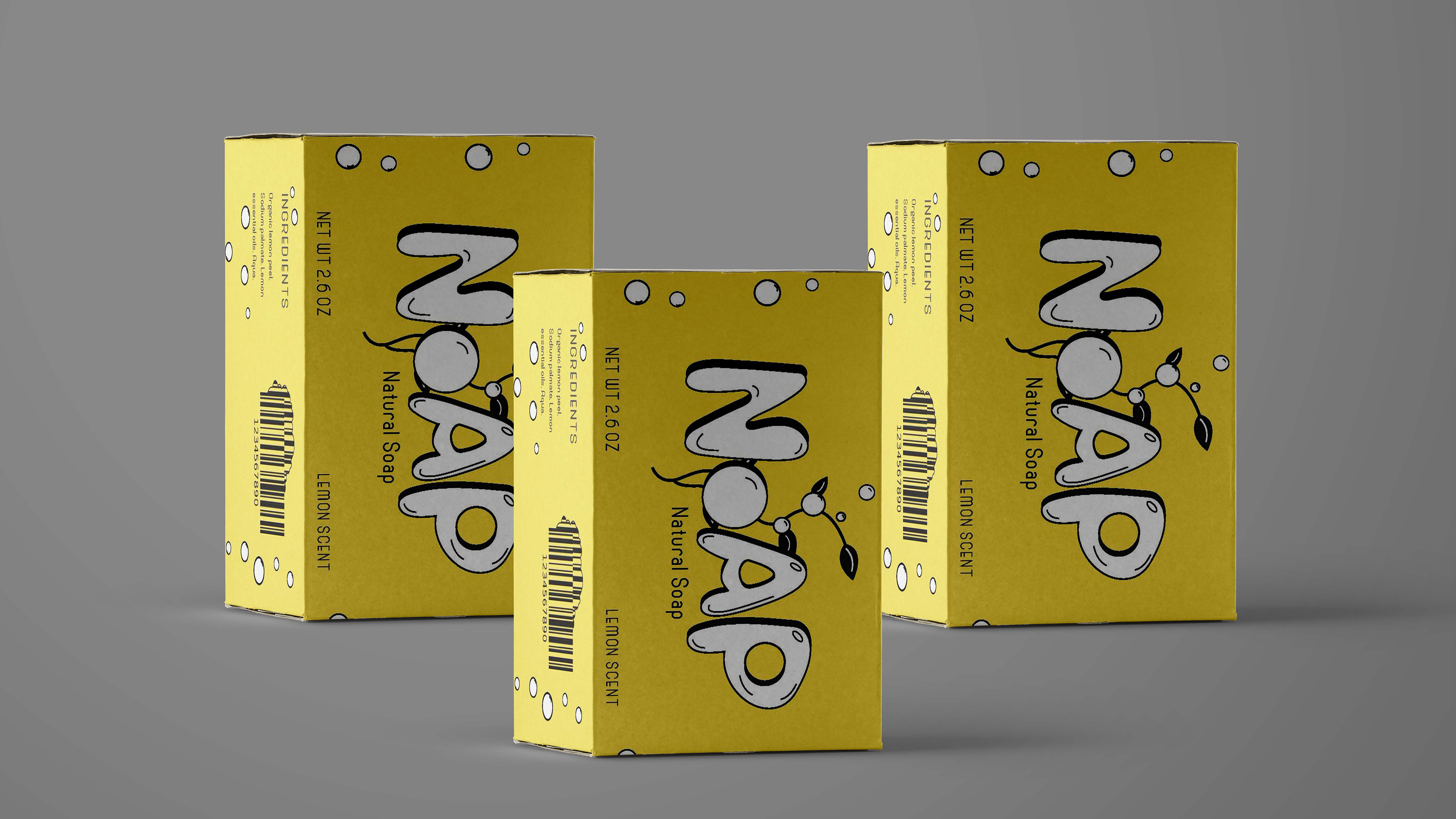
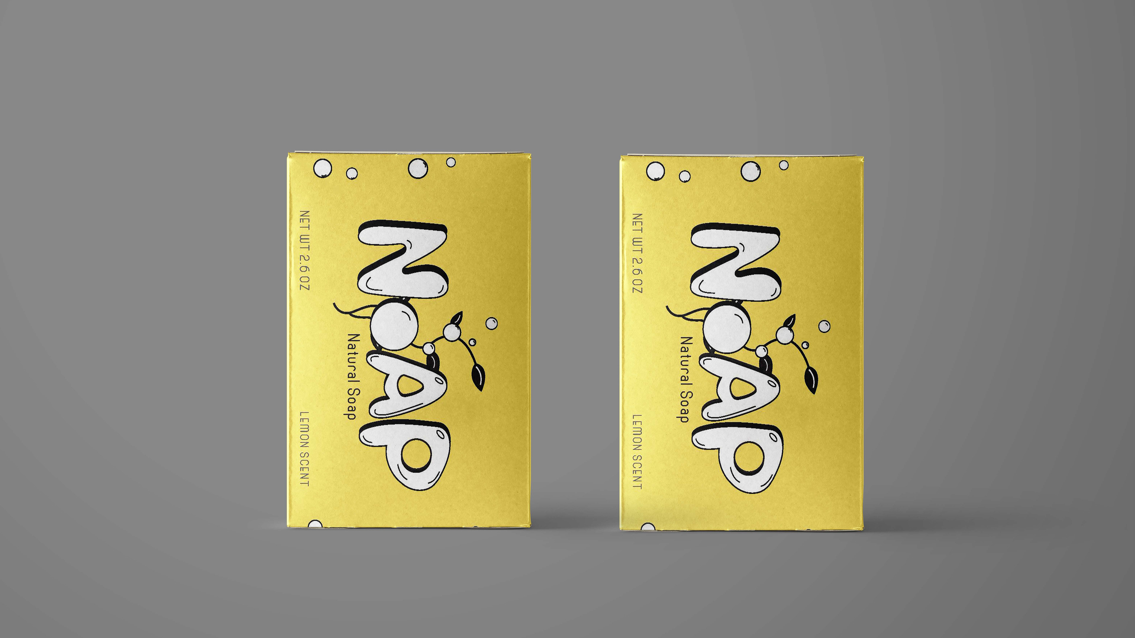
Going in order of the way the projects are listed, for my mobile app project I created an application for Stumpy’s Hatchet House, which is an axe throwing place in Greenville. The app allows users to have an easier stay by letting you sign waivers, reserve lanes, pay drink tabs, keep score, and more all on your phone. While designing the app, I kept Stumpy’s already established color scheme, typefaces, and logo to ensure the app, location, and website are all cohesive. For my beer project, I created “40 Grit”, this beer is designed for the working class and their slogan is “A smooth beer for a rough day”. When thinking of the working class, I thought of construction workers which led me to create the idea of 40 Grit sandpaper. The can is white with a rough and sanded texture in gray behind the contents of the logo to continue the rustic style of the beer. Moving on to my personal mark and resume, when creating my logo, I used two cropped small S’s that create a large S within the negative space. I chose a sans serif typeface to better fit my style of work, which is typically more on the modern side. My currency redesign project is a family of seven bills that are designed around the environmental movement. The environmental movement was created to protect the earth and attempt to lower pollution and global warming. Each bill has its own theme that corresponds with the back of the bill which are all supposed to inform the users on the issues and give them ways to help. The one-dollar bill stands for saving the aquatic life such as turtles and the coral reefs. The two-dollar bill is about deforestation and promotes planting trees in a way to improve this problem. The five-dollar bill promotes recycling to stop littering, and the ten-dollar bill is representing windmill power that will help decrease the use of powerlines which will lower the increase of global warming. The twenty-dollar bill is also playing off of air pollution and promotes taking a bike rather then a car. Lastly the fifty-dollar bill is another littering bill which promotes cleaning up after yourself but this time it focuses on the mountains. Another project that I included in this review is my package design that I completed sophomore year. I was assigned to make a natural soap package and brand. I created Noap, a natural lemon scented soap that is locally made in Eastern North Carolina. The name of the brand is displayed in a hand drawn bubble typeface to match the bubble design that is shown on all sides of the package. I decided to limit the amount of information on the box since many natural and organic brands tend to have little amounts of words. This keeps the main focus on the logo itself and can result in a quick grab in the store. Overall, all of the projects that I have completed up until this point have helped me complete the next one as I’ve learned new skills and improved the quality in the process and work.
@sscottdesign
shelbyscottdesign@gmail.com
252.548.4907
shelbyscottdesign@gmail.com
252.548.4907