

As a current student of the graphic design program, I am continually growing my knowledge of design and expanding my abilities in the field. My design work shows advancement over the years I have spent learning all I can about Graphic Design. My interest in graphic design grows with each new project I do. My process always starts with gathering information on what I am working on and creating a file of notes and pictures to draw inspiration.
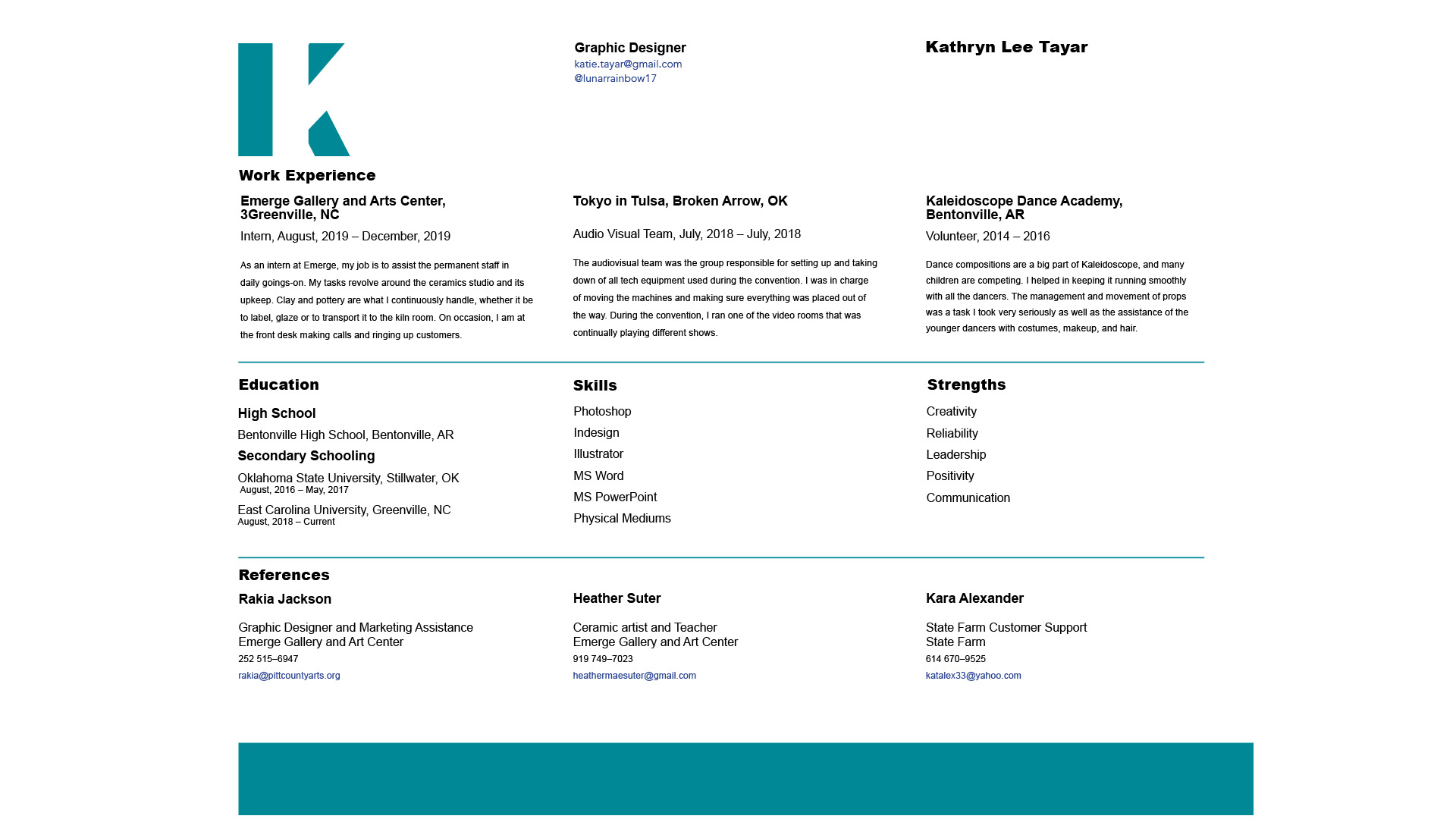
Adobe is what I mainly work on, more specifically Adobe Illustrator, InDesign, Photoshop, XD, and DreamWeaver. However, I also enjoy creating using classic pencil and paper. I lean towards San Serif fonts in my work, including Helvetica, Futura, and Impact, all of which I find I go to first when creating. My coloring can also be quite distinct as I choose colors both on if it is appropriate but the meaning behind them. This idea of colors having sense is the reason I use blues and greens but also reds and blacks. The teal on my resume combines the calm of blue with the renewal of green, which relays a message of a level-headed individual with new ideas. The use of red and black is a typical color pallet to create high color contrast and drama to a piece. This color pallet has a more modern look for work. Colors mostly influence my work as I believe color is the first thing a person sees before anything that is written, so I make sure the color portrays the message I want it to send. Overall, my work has a sense of simplicity in its design.
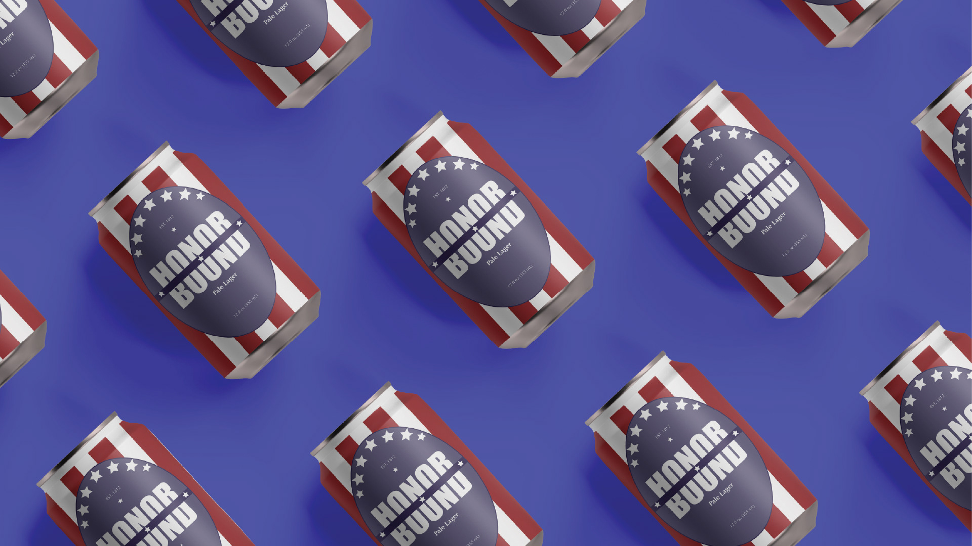
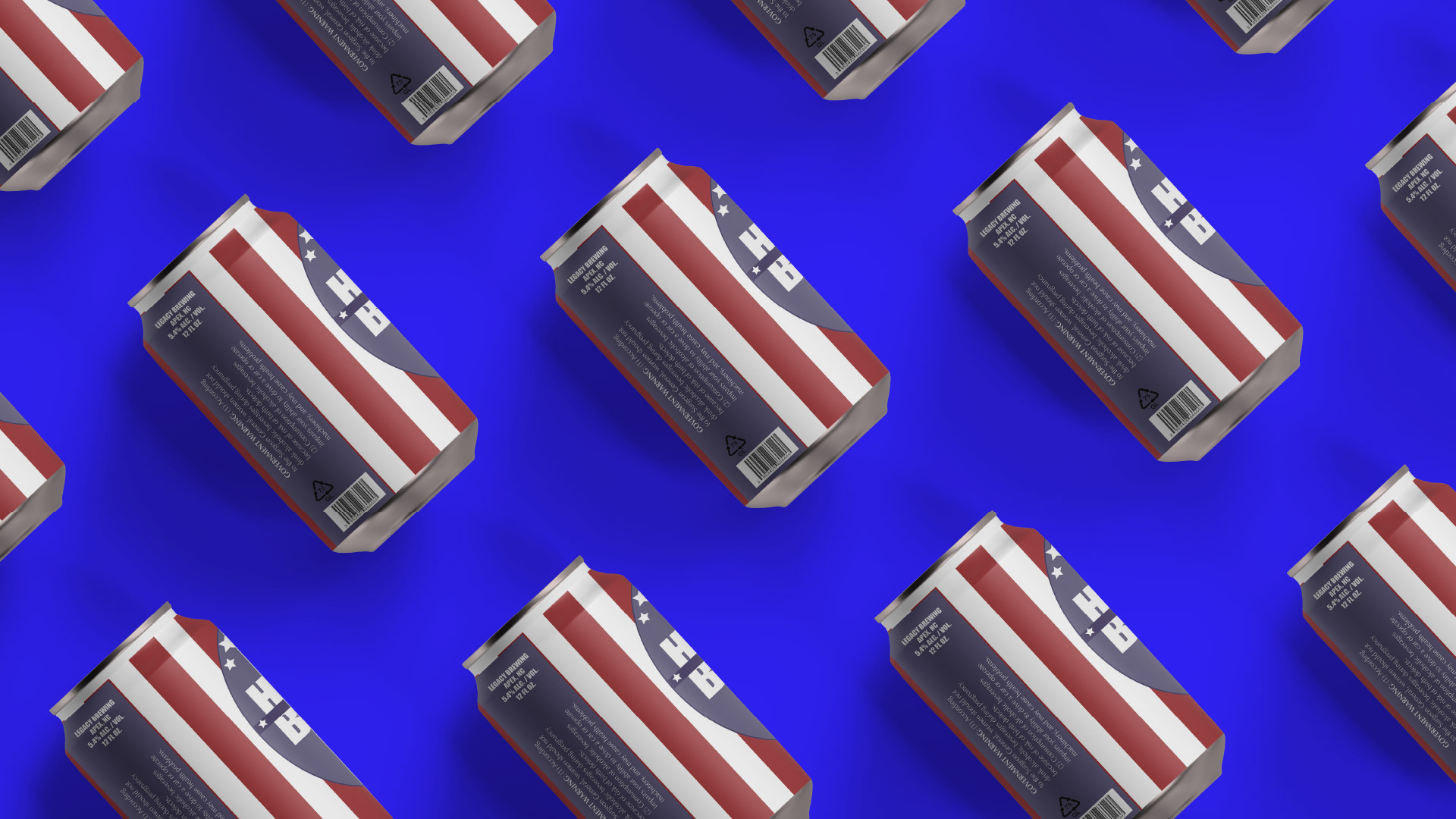
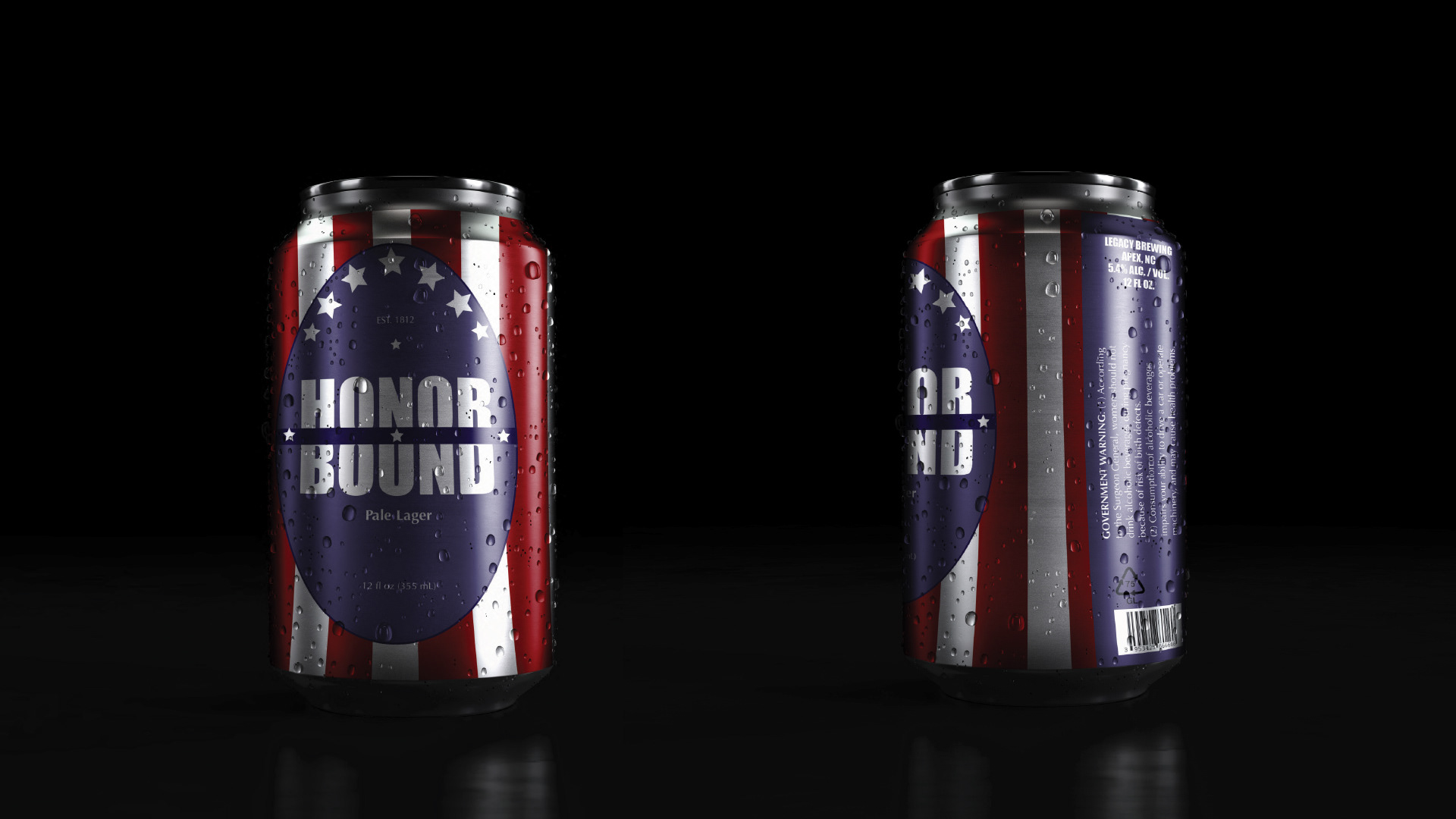
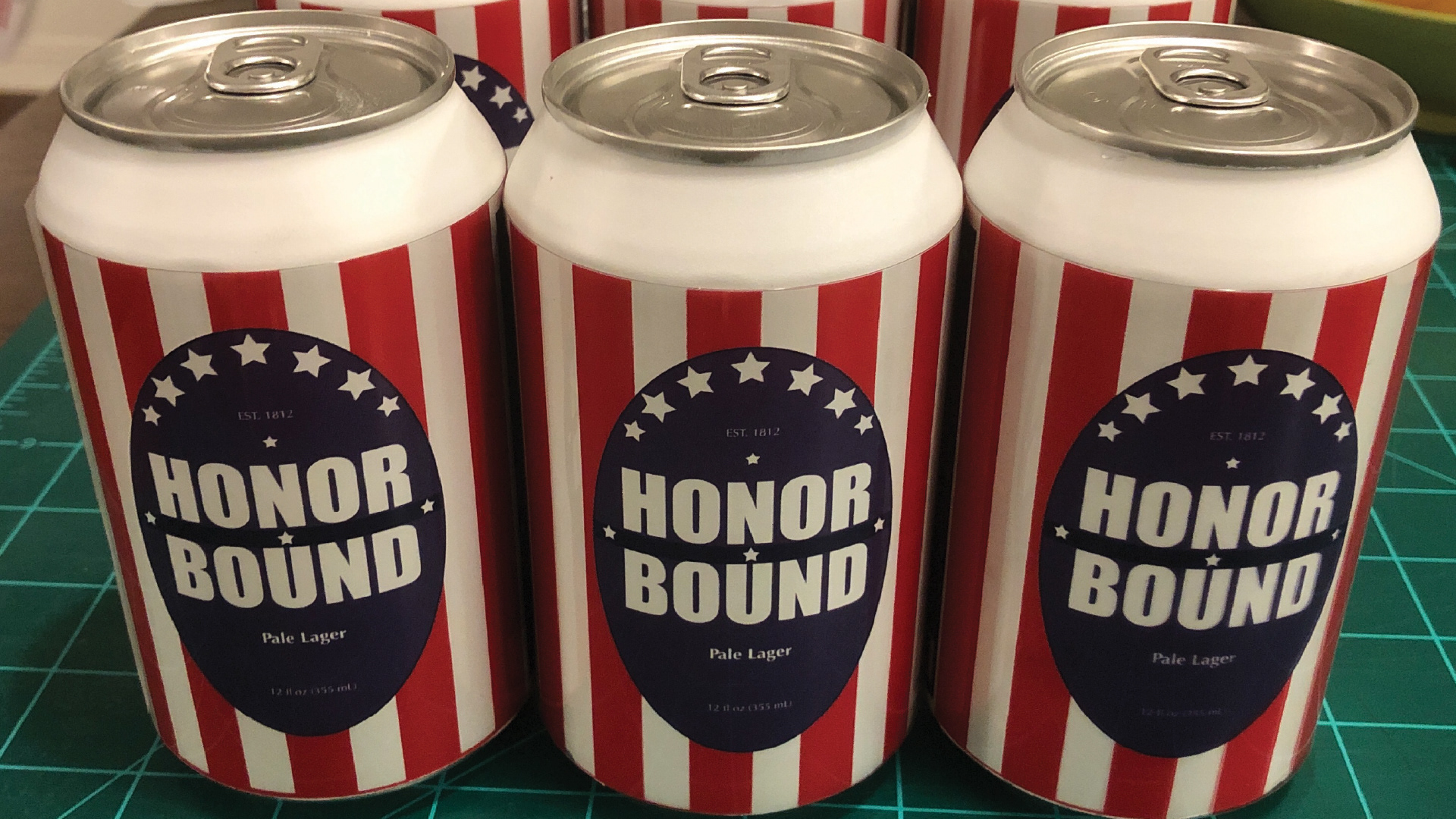
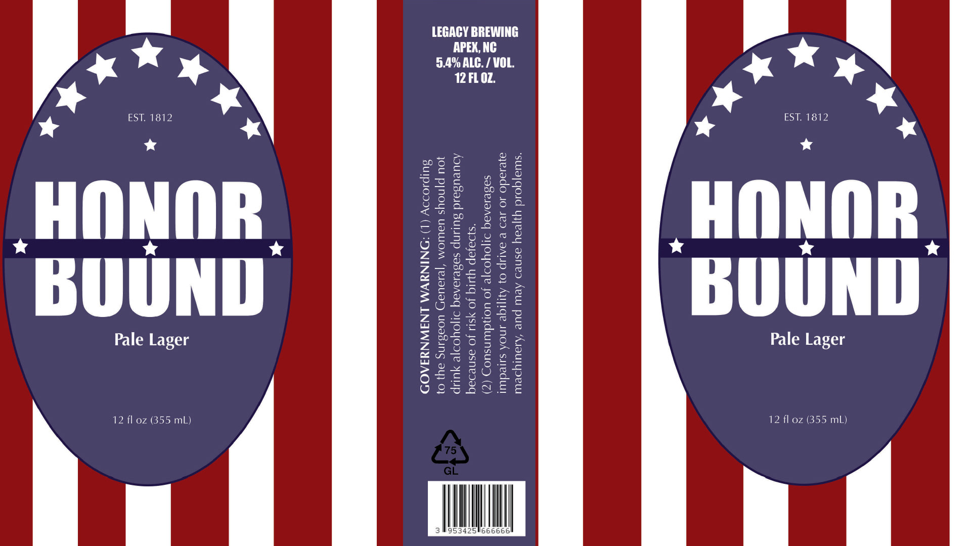
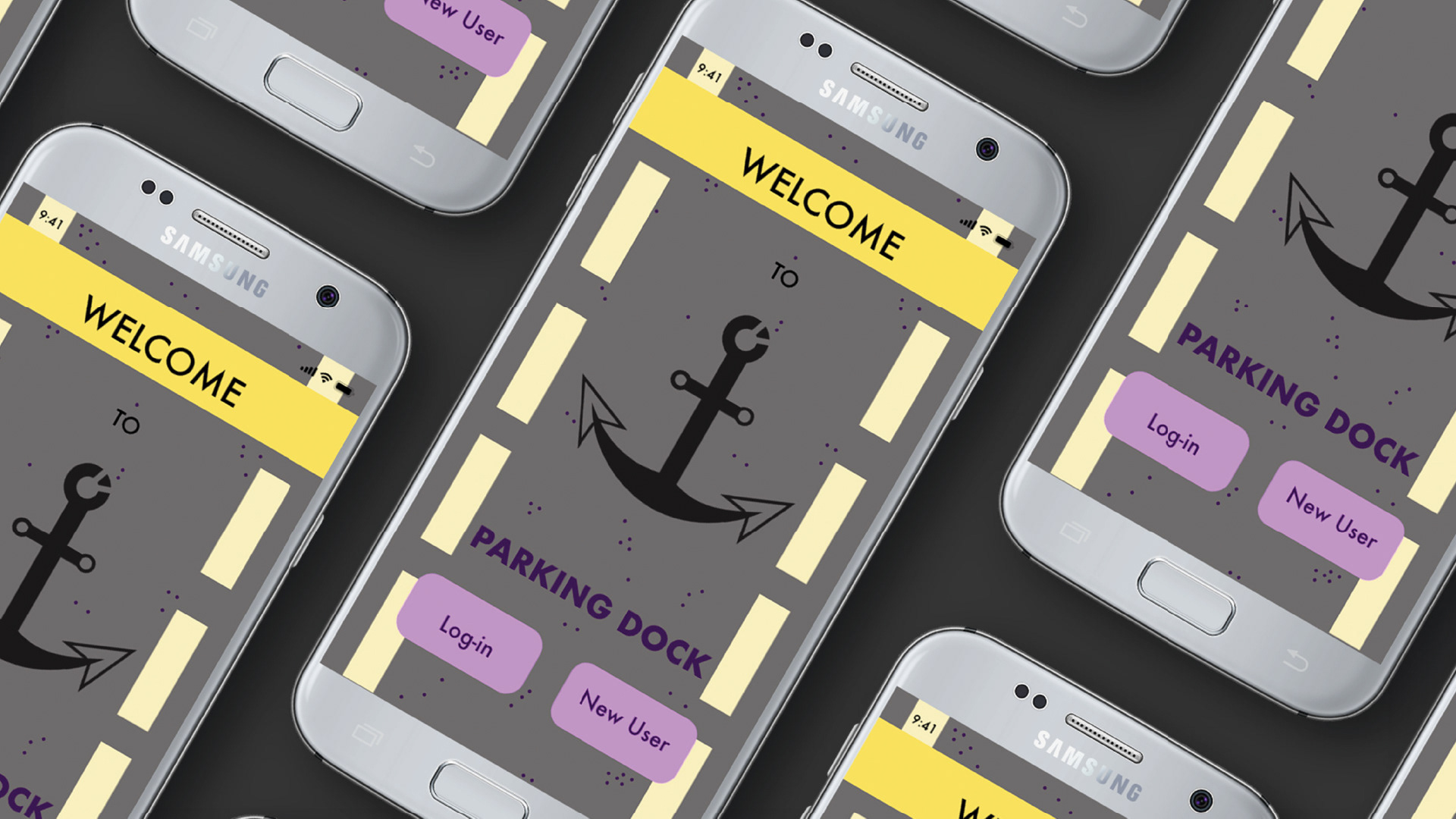
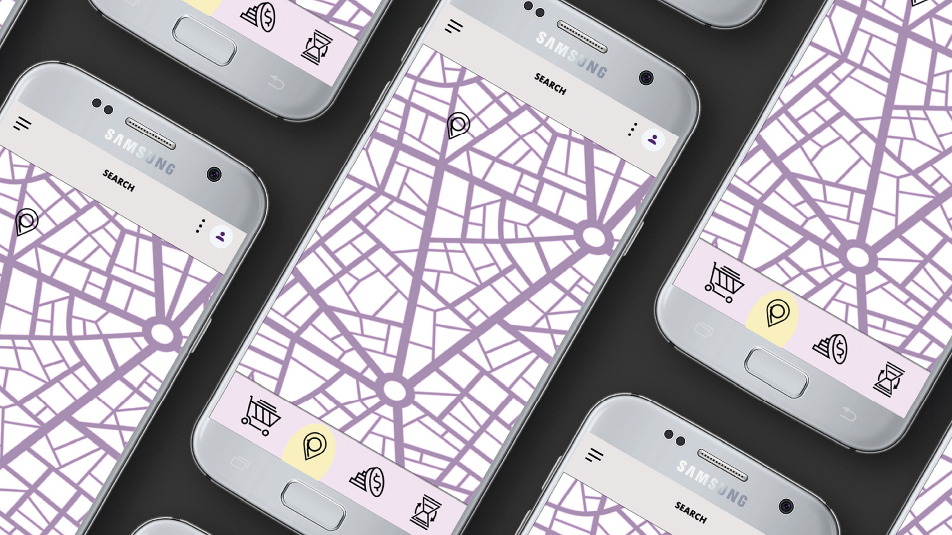
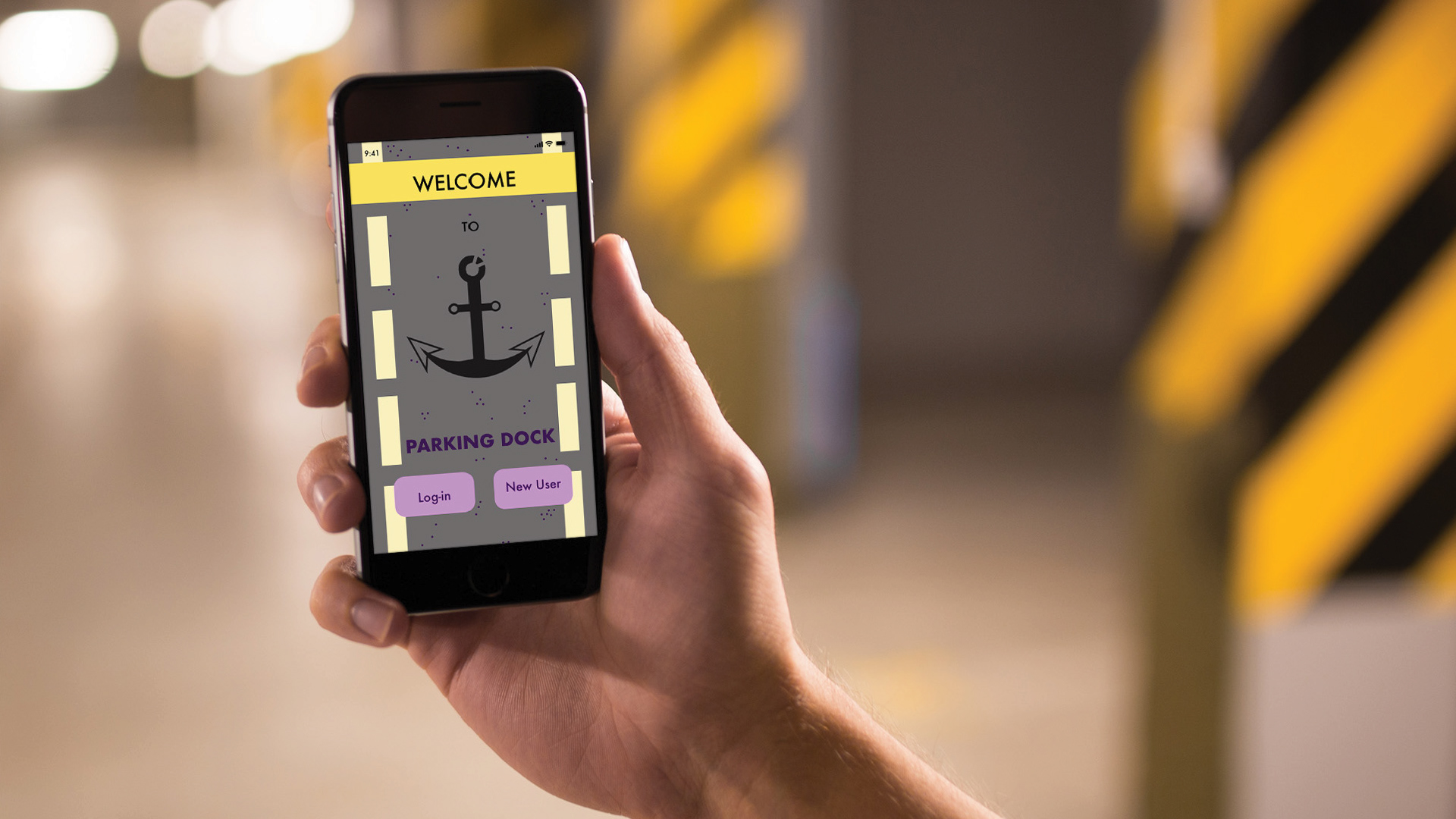
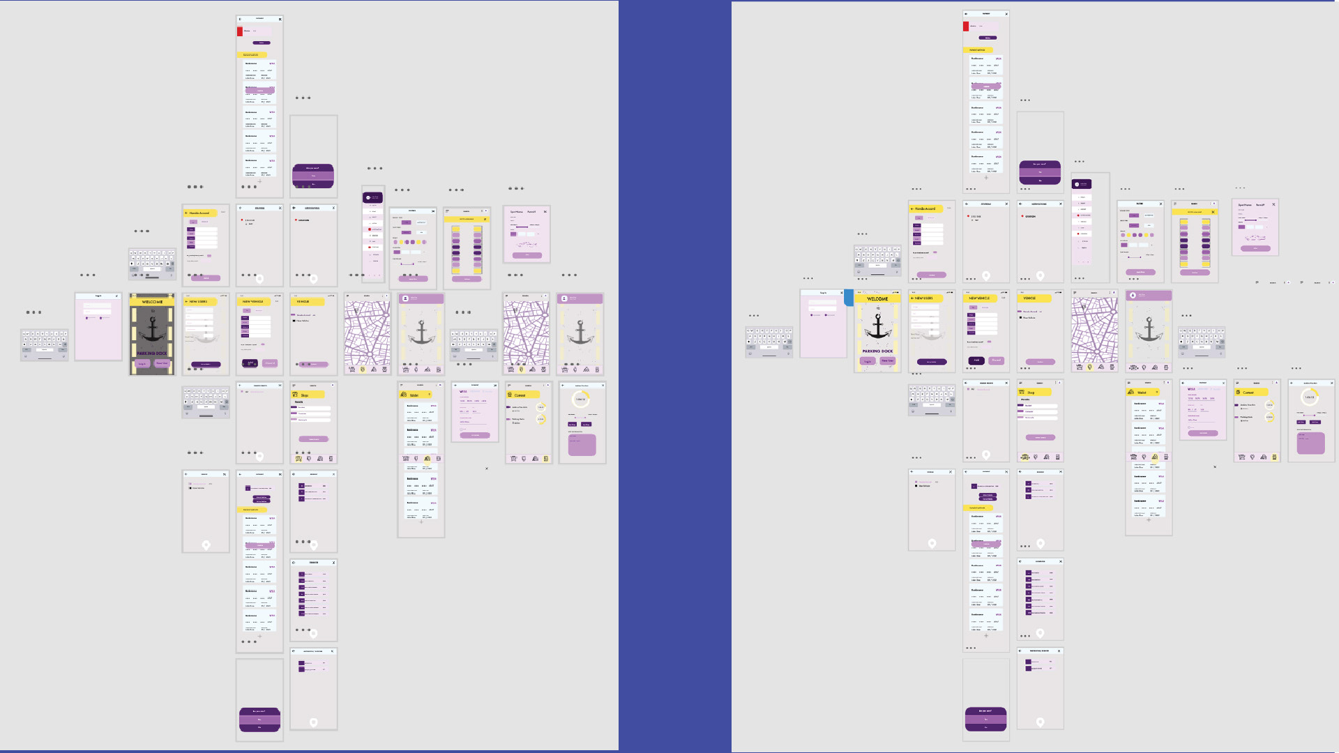
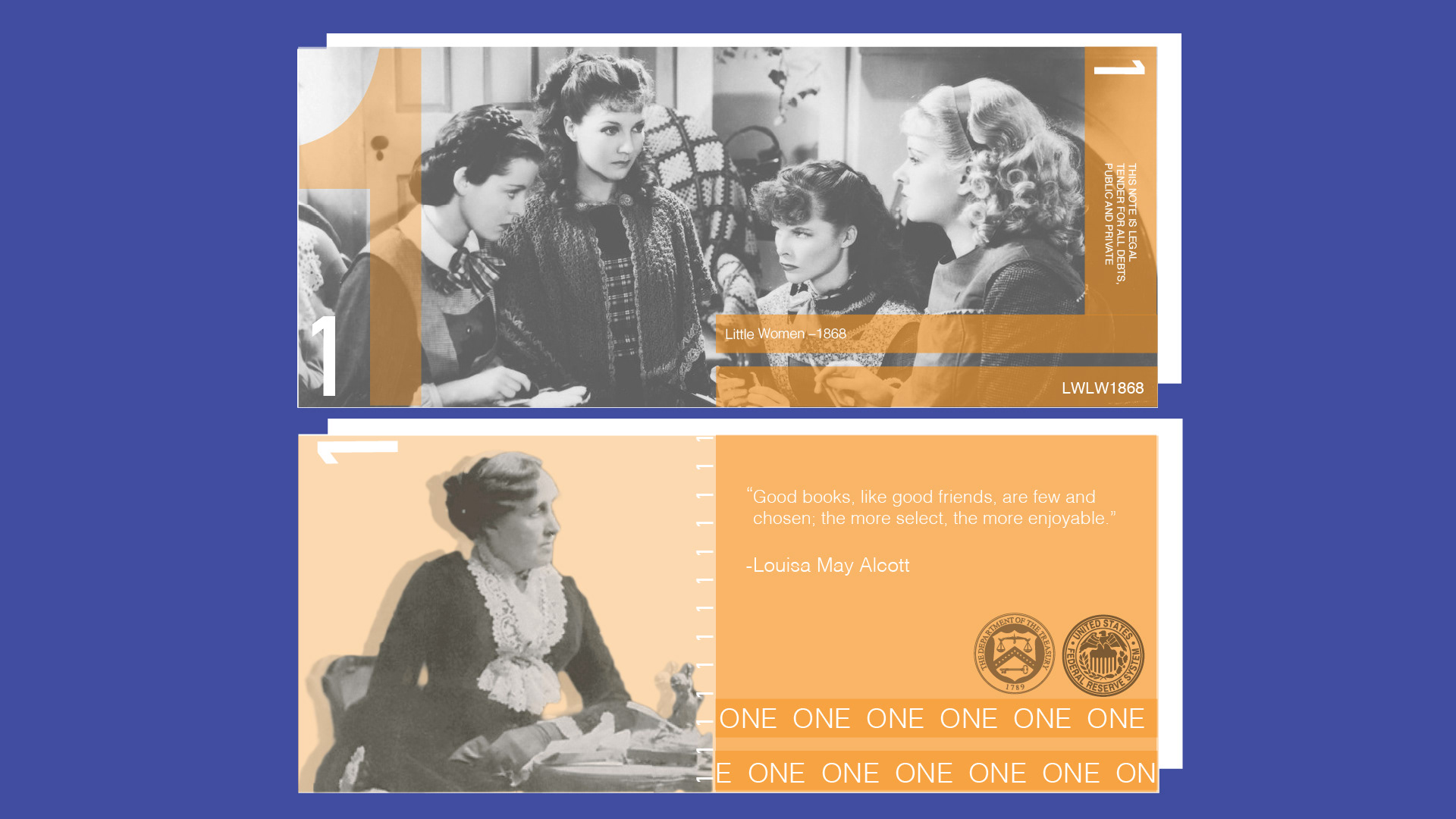
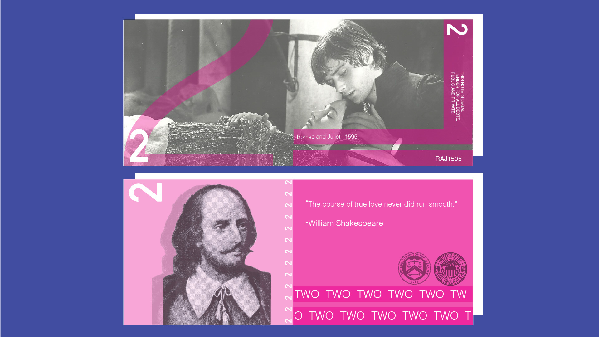
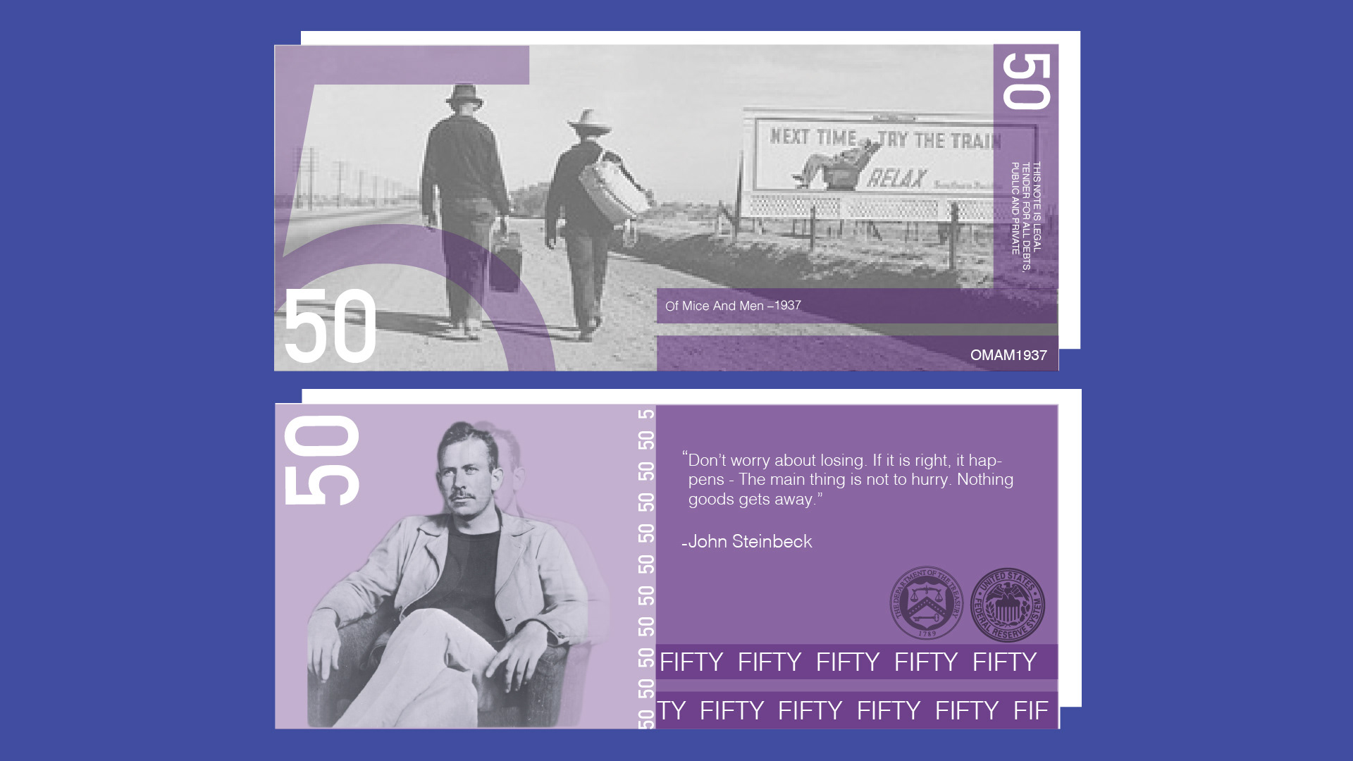
The future, for me, is full of opportunities. I want to explore UI/UX more as I enjoyed learning about User Interfacing and User Experience. Using this knowledge to design an app was such a fun experience that I want to expand on the topic and go further. I would enjoy going into app design and web design as my job, but I believe I still have a lot to learn. Not only do I love UI/UX, but I also enjoy print work and packaging. My work on the beer packaging shows my use of simple design and color choice. Since it was a beer for the hard-working American, I chose a very patriotic color scheme with the red, white, and blue and the classic American flag stripes. The work I did for the currency project was very challenging but rewarding. The research behind that project was extensive, as I wanted the books portrayed to be recognizable. It took a lot of trial and error to create the result that I felt was good enough.
As a designer, I want to be seen by others as someone who is not only a level-headed problem solver but someone willing to learn new things at any point—a positive person who will do their best to create not only useful but elegant designs. I strive to be helpful, and I believe I can do that through Graphic Design. A Graphic Designer does so much for the world, and people rarely recognize it. Still, those designers create the packaging you see, the posters, the billboards, the websites, the fliers, and even small business cards, and I think that’s beautiful.
@lunarrainbow17
katie.tayar@gmail.com
Find me on LinkedIn.
Find me on Behance.
View my full portfolio here.