


I’ve always considered graphic design a means to discuss bold, complex, and prevalent issues through manipulating visuals, color, and type in direct communication with a wide audience. Design is a way to introduce a topic and convey my own feelings simultaneously or encourage the stance I want my audience to take. I see graphic design as visual communication, not just ‘art’ or a ‘play-on-words'. I enjoy the notion that designers can communicate in intricate and clear ways without having to say a word, to both an individual spectator and a crowd.
I look up to designers and illustrators like Joby Harris, Michael Bierut, Cody Weiler, and Natasha Jen. I am influenced by social issues and sociological theory, psychology, color theory, biology and botany, history, anthropology, and religion. I love considering the complexity of visuals and colors I use as to where they stand as representatives of historical moments, details that speak to the subject’s origin, symbols for complex ideas, and their similarity to natural objects.
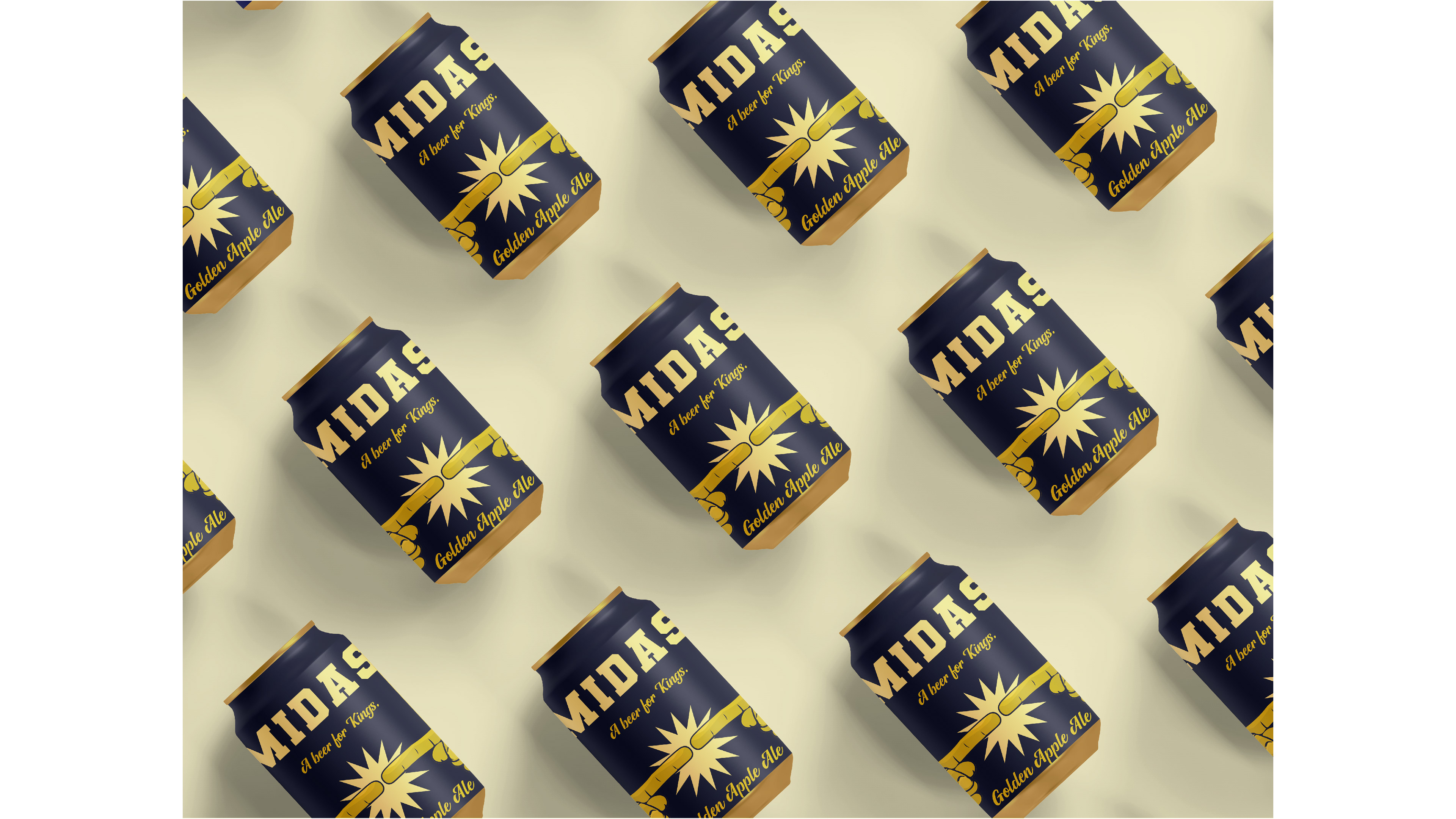
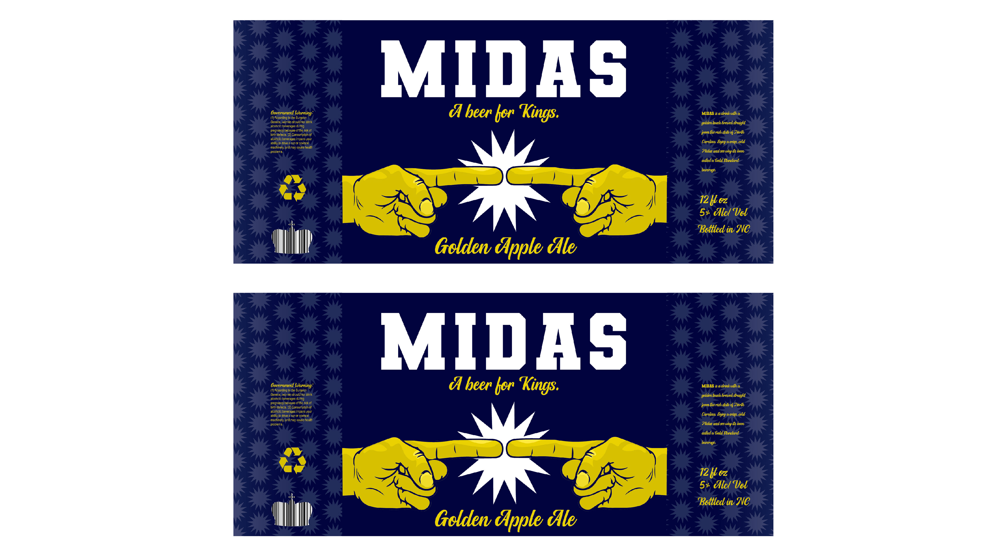
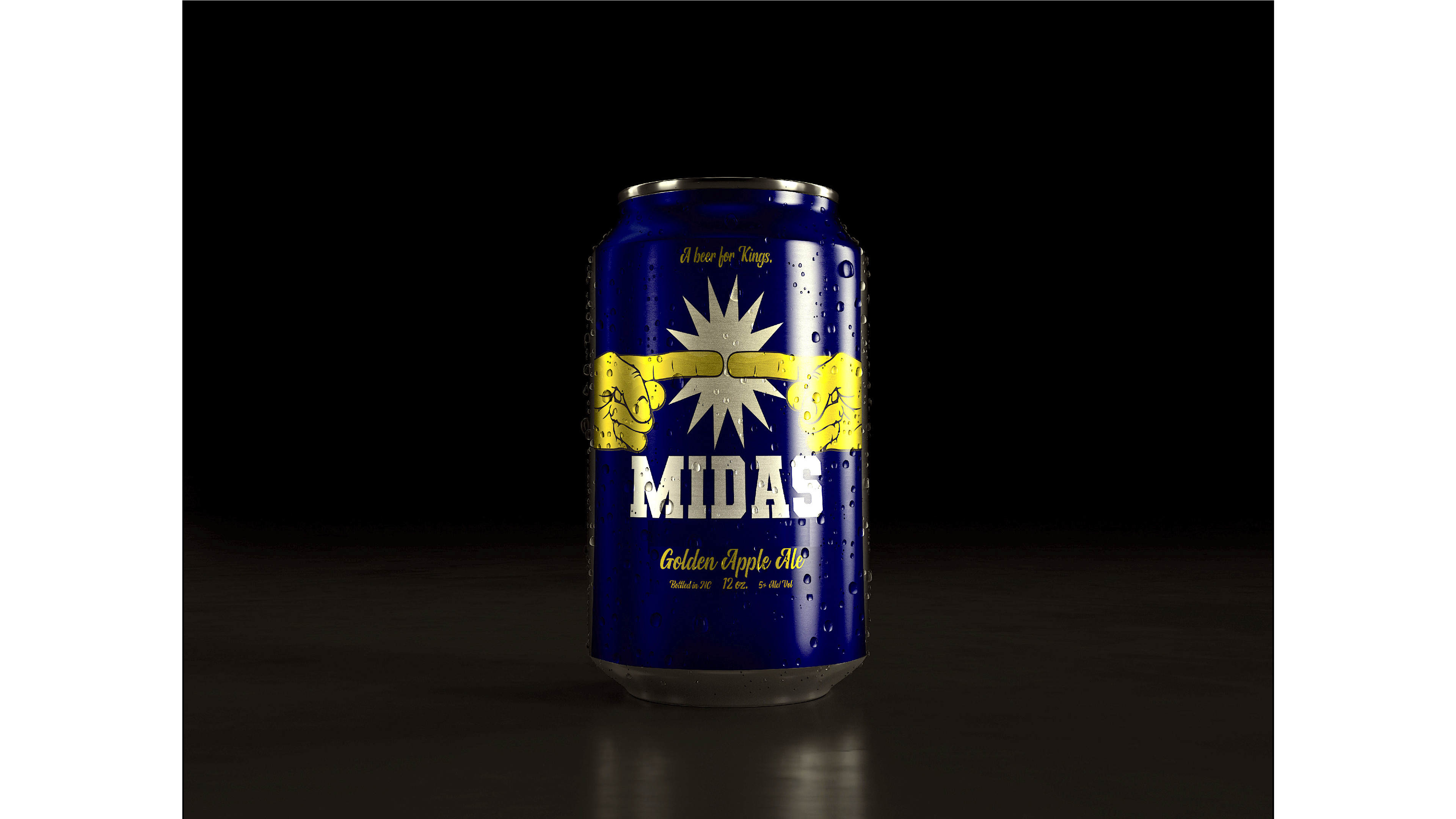
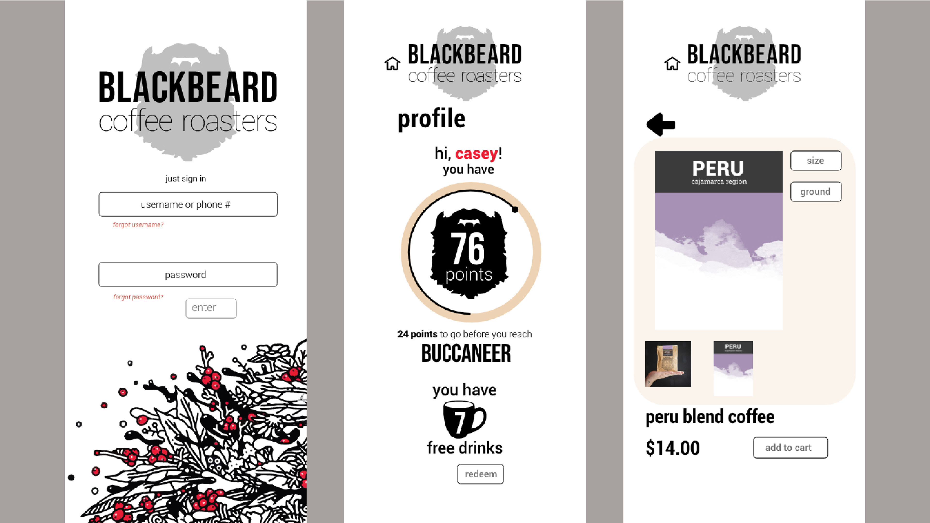
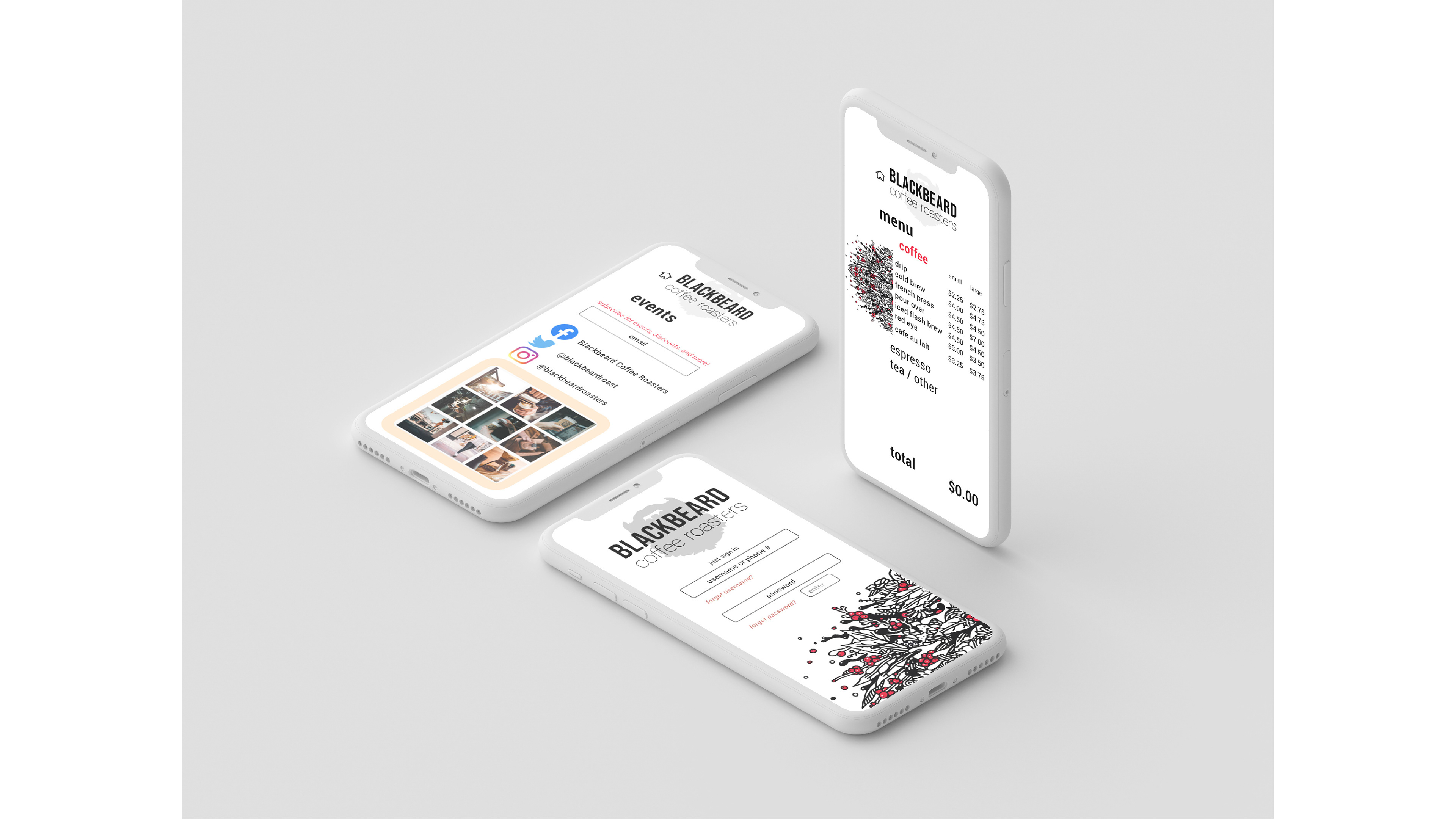
I have gravitated towards branding, advertising, and packaging projects since starting my graphic design studies. With my dual printmaking studies, I know I want to delve deep into letterpress printing as well. I enjoy creating brand identities and using a consistent design in versatile ways. I find that packaging allows me to explore conceptually and tactically with how I want to communicate aesthetics and marketing. Advertising feels like verbalized dialogue put into pictures, more direct communication compared to other forms of design work, and I love how visual elements strengthen a message and influence a specific attitude on a topic.
I have gravitated towards branding, advertising, and packaging projects since starting my graphic design studies. With my dual printmaking studies, I know I want to delve deep into letterpress printing as well. I enjoy creating brand identities and using a consistent design in versatile ways. I find that packaging allows me to explore conceptually and tactically with how I want to communicate aesthetics and marketing. Advertising feels like verbalized dialogue put into pictures, more direct communication compared to other forms of design work, and I love how visual elements strengthen a message and influence a specific attitude on a topic.
My work centers around complex or socially relevant concepts, and I generally try to communicate my own direct thoughts through my designs. I am rather detail-oriented and interested in the line between context and subtext; I find meaning in even the smallest elements of my work. I lean towards bright, high-contrast color palettes, generally cooler tones and more ‘relaxed’ (muted or pastel) hues. My tendency is to combine intricate layers of information and dual-meaning and present things in a minimalist way. I have a habit of starting projects with an overwhelming variety of ideas, only to end up with a narrowed-down, simpler product. I enjoy experimenting with grid, organic compositions, and finding ways to create visual elements out of numerical or typographic information. I focus a lot on creating harmony in the hierarchy between typography and dynamic illustrations.
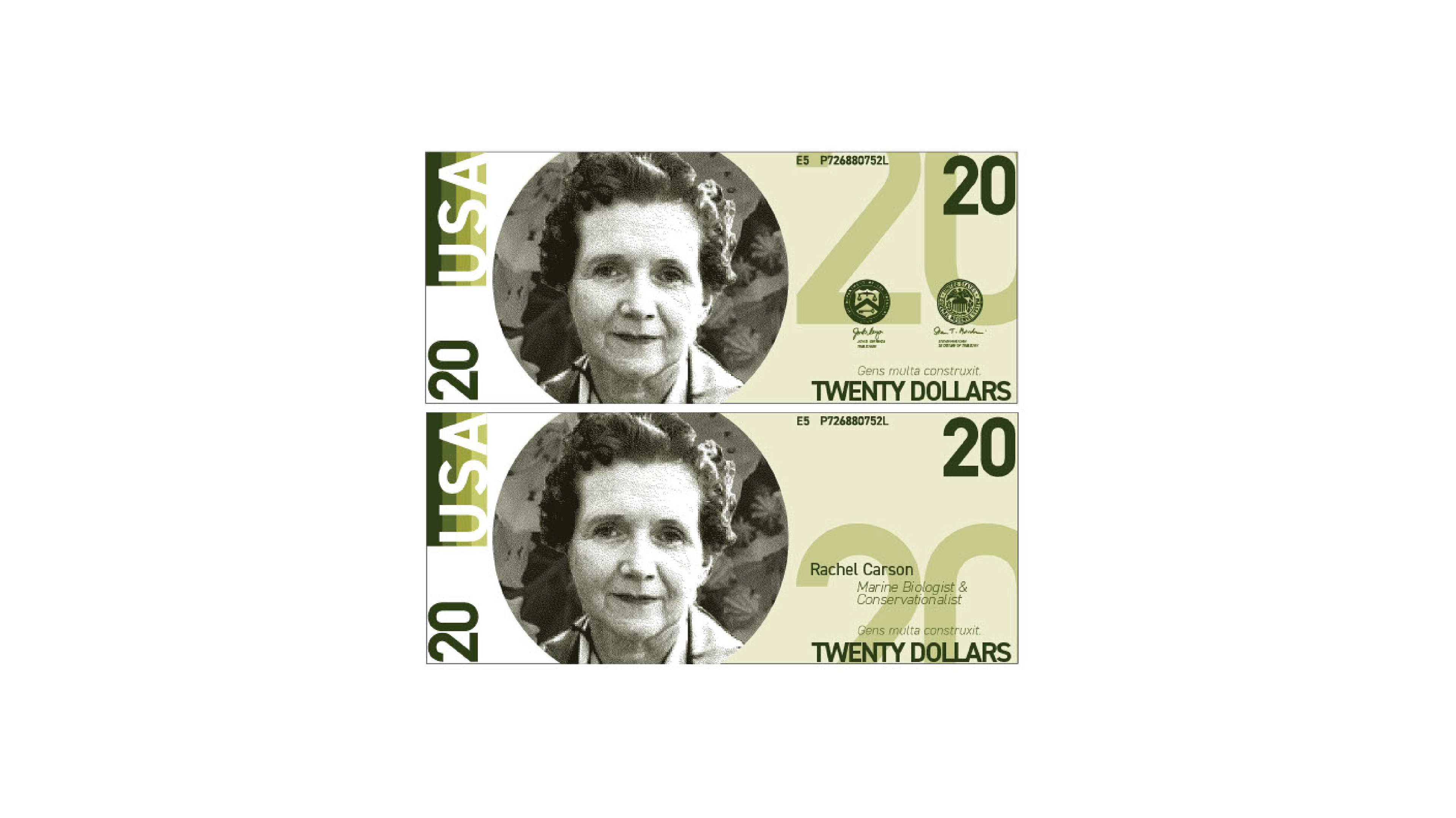
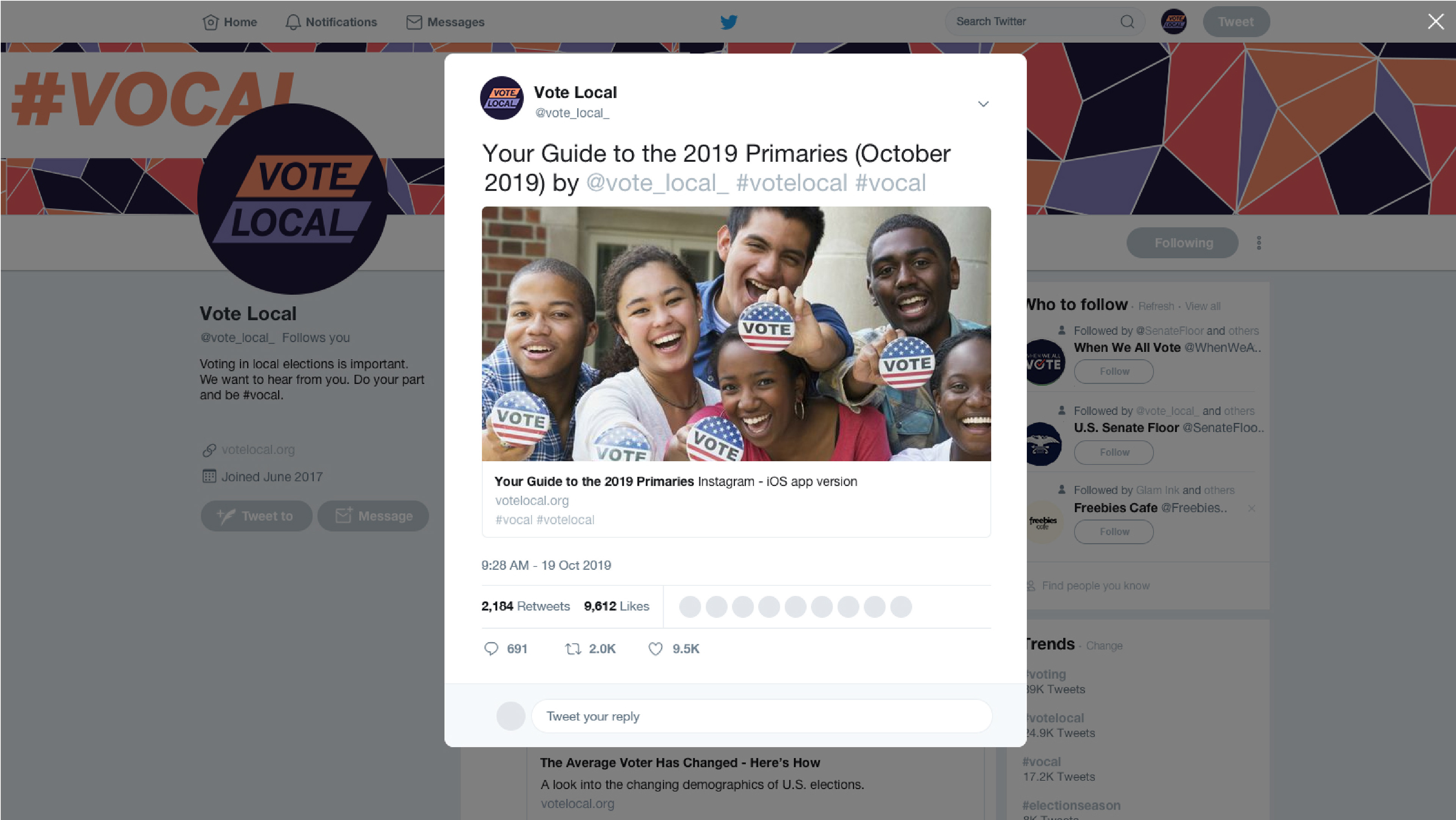
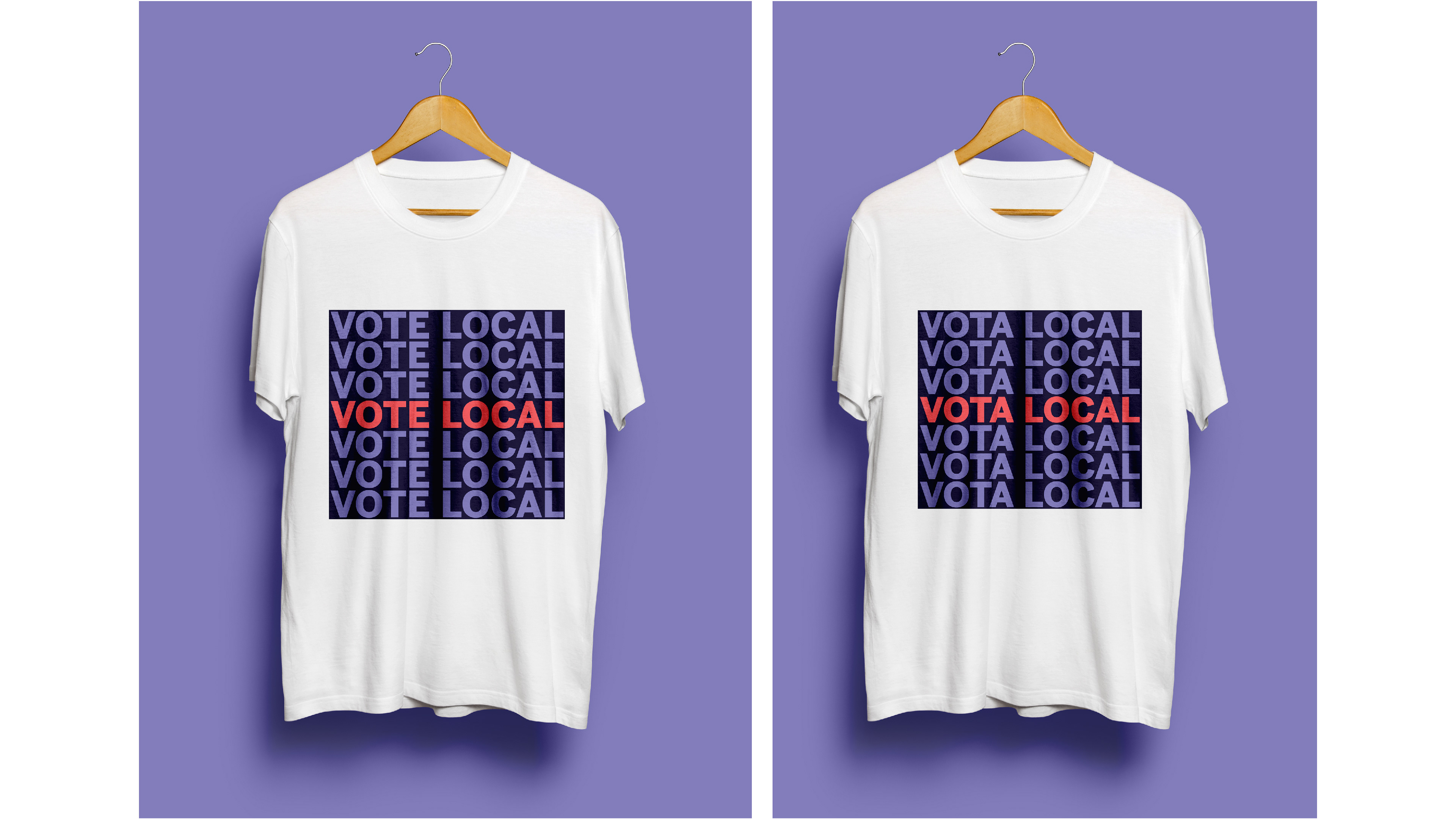
I enjoy satirical or ironic themes to take a nonchalant route of communication with serious topics, or to highlight ideological and conceptual discrepancies. I want to professionally tackle intense topics, challenging projects, and create eye-catching visuals to address high-importance issues in our society. I enjoy marketing products on a commercial level, but I also want to market ideas, and advertise awareness in a social sphere. I find that design is a more approachable way to create dialogue, and I want to be the person that starts conversations. My goal is to be known as an aware, intentional, decisive designer with strong messages.